Canadian Journey
The set of themes that would ultimately be chosen had to adhere to modern banknote security design principles and "reflect fundamental values recognized and cherished across the country".
[3] All banknotes in the series feature a stylised Flag of Canada in the upper right-hand corner of the obverse,[7] and measured 152.4 by 69.85 millimetres (6.000 by 2.750 in).
In addition to improving the security of the substrate and the integration of security features in the banknote designs, the Bank of Canada also launched a public education campaign, actively deterred counterfeiting by closer collaboration with law enforcement, and accelerated the removal and destruction of banknotes from older series from circulation.
[13] In the mid 1990s, the Bank of Canada tested a new substrate, named "Luminus"[14] and produced by Domtar, for use in printing banknotes.
[15] It printed 100,000 experimental $5 banknotes, using the Birds of Canada design, having a substrate of polymer core between two layers of cotton paper.
[16][15] As a result, the Bank of Canada chose to use the standard watermarked paper, but required suppliers to include a "windowed metallic thread" in the substrate.
[4] These features included: intaglio printing, such as the raised ink in some numerals; microprinting, such as in the descriptions adjacent to the building vignettes on the obverse of each banknote; a holographic stripe adjacent to the portrait, with iridescent maple leaves shifting from a matte to shiny gold when tilted; a watermark of the portrait and denomination's value in an empty space near the building vignettes; a see-through number with disjoint components appearing as a complete numeral when viewed with background lighting; a colour-shifting thread embedded on one side of the banknote, on which is printed the banknote's denomination; and features visible when exposed to ultraviolet light.
[20] When a banknote is backlit, the "ghost-like" portrait in the watermark will become visible and the colour-shifting thread is revealed as a set of windows along a continuous line that shift colour when tilted.
[21] The maple leaves on the holographic metallic strip appear to move when the note is tilted, and each is split by a colour change.
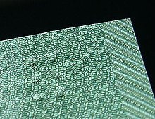
[21] The series also excluded former security features, such as the planchettes, green dots randomly occurring on the surface of the banknotes.
[22] The Bank of Canada began investigating integration of accessibility features into banknotes with the passage of the Canadian Human Rights Act in 1977.
This series was the first issued by the Bank of Canada to incorporate a tactile feature to allow individuals with visual impairments to determine a banknote's denomination.
The feature was developed by the Canadian Bank Note Company, which collaborated with Queen's University tactility perception expert for symbol design.
[24] It produced 48 sample designs, of which six were selected for final consideration based on tactility, production techniques, and banknote thickness.
[15] The numerals were about 30% larger than in the Birds of Canada series and were chosen after testing conducted by vision experts at the University of Waterloo.
[7] The reverse features a depiction of the banknote's theme, with images of children tobogganing, skating, and playing hockey on a frozen pond.
[28][30] In the centre is a female Royal Canadian Air Force officer depicted in peacekeeping duties[28] wearing a combat uniform and blue beret.
[32] Underneath it is an equivalent excerpt from "Au champ d'honneur", the French translation of the poem written by Jean Pariseau.
[33] The reverse depicts the chosen theme using illustrations of artwork created by Bill Reid, an artist of maternal Haida heritage from which he draws creative inspiration.
[33] To the far left is an illustration of The Raven and the First Men, a laminated yellow cedar sculpture housed at the Museum of Anthropology at the University of British Columbia, adjacent to which is an excerpt from the 1961 book La Montagne secrète by Gabrielle Roy and its English translation by Harry Binsse.
[35] In the upper right-hand corner is an illustration depicting the sculpture Mythic Messengers, an 8.5 metres (28 ft) bronze frieze now installed at the Bill Reid Gallery of Northwest Coast Art.
[33] The obverse portrait is of William Lyon Mackenzie King created using a computer-assisted engraving process by Giesecke & Devrient.
[38] In the lower left-hand corner is an illustration of a birch bark canoe and a 1632 map of New France by Samuel de Champlain, above which is a quotation from the poem Jaques Cartier in Toronto by Miriam Waddington and a French translation by Christine Klein-Letaud.
[42] The banknotes in the series with the holographic metallic stripe were counterfeited by "well-organized, well-financed groups" having the resources and time to replicate the security features.
[45] The operation was also beginning production of counterfeit United States Federal Reserve Notes and traded in fraudulent payment cards and identity documents.
[11] All banknotes in this series are now considered unfit for circulation due to their lacking any modern security features, such as a metallic stripe.
[48] When the $10 banknote was first issued, the Bank of Canada also announced a numismatics set for notaphilists titled Lasting Impressions.
[49] Both were released in an embossed folder also containing an information booklet with the history of the respective denomination and the features of each banknote.
[51] Amongst the qualities cited for the award were "probably the finest portrait of the mature monarch to appear on any bank note" and "well-balanced design, strong images, and advanced security features".
[27] Some Canadians have modified the $5 banknotes by drawing over the portrait of Wilfrid Laurier to make it appear as the character Spock (as portrayed by Leonard Nimoy) from the fictional universe of Star Trek, or as the character Severus Snape (as portrayed by Alan Rickman) from the Harry Potter film series.