Cartographic propaganda
[4] Because the word propaganda has become a pejorative, it has been suggested that mapmaking of this kind should be described as "persuasive cartography", defined as maps intended primarily to influence opinions or beliefs – to send a message – rather than to communicate geographic information.
During the Renaissance maps became more widely used in general and their use began to take on a more cultural and political character, more similar to the cartographic propaganda that is seen today.
During this period, this approach to cartography expanded to Italy, Spain, and Portugal as cartographers and propagandists found inspiration in the "positivistic trends of the German world".
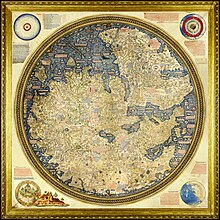
[23] The Fra Mauro World Map (1450) was intended for display in Venice and shows the Portuguese discoveries in Africa and emphasizes the feats of Marco Polo.
[25] In this map, King Philip II is shown riding the turbulent Atlantic Ocean on a chariot; this illustration is reminiscent of the Roman God Neptune.
In the introduction of the atlas Quin wrote, "we have covered alike in all the periods with a flat olive shading ... barbarous and uncivilized countries such as the interior of Africa at the present moment.
[29] A few decades later, Henry VI of France celebrated the reunification of his kingdom [dubious – discuss] through the creation of the atlas, "Le theatre francoys".
[30] In the later nineteenth and twentieth centuries the political potential of cartographic shapes became used more widely and began to be used for more blatantly propagandistic purposes.
Henri Dron used the figure of the world map in the 1869 propaganda poster, "L'Europe des Points Noirs".
[36] The goal of cartographic propaganda is to mold the map’s message by emphasizing supporting features while suppressing contradictory information.
Before the U.S. had entered into WW II, U.S. President Franklin D. Roosevelt came to possess a German map of Central and South America that depicted all Latin American republics reduced to "five vassal states ... bringing the whole continent under their [Nazi] domination.
"[37] FDR viewed this as an open threat to "our great life line, the Panama Canal" and therefore mean that "the Nazi design is not only against South America, but against the U.S. as well.
[38] The Nazi regime also used maps to persuade the United States to remain neutral during WW II by flattering both isolationism and Monroe Doctrine militarism.
[39] "Spheres of Influence", created and published in 1941, uses bold lines traced around sections of the globe to send a clear message to Americans: stay in your own hemisphere and out of Europe.
[42] The Soviet Union had deliberately falsified virtually all public maps of the country, misplacing streets, distorting boundaries, and omitting geographical features.
A recent example is the map produced by the Vote Leave campaign for Brexit, which aimed to persuade the voter of the vulnerability of the UK to uncontrolled immigration from the Middle East after a scenario of increased EU expansion.
The use of graphical devices, such as the use of bold red arrows to suggest a threat of invasion, communicated a sense of fear and supported the theme of taking back control of borders.
During the Cold War period, maps of "us" versus "them" were drawn to emphasize the threat represented by the USSR and its allies.
[44] Adolf Hitler's schoolroom map of "Deutschland" in 1935 presented all the German-speaking areas surrounding Germany without borders, claiming them as part of the Reich.
[46] The map illustrated Russia as a nation rich in natural resources and failed to mention the famine that occurred only five years earlier (1891-5) during which half a million people had died.
The dispute, which led to long-drawn desultory warfare between the two countries, was later settled by the International Court of Justice in 1994 which awarded the entire area to Chad.
In response, immigration officials in India, Vietnam, and the Philippines reacted by enacting a policy of inserting their own forms and maps into the travel documents of Chinese visitors.