Color theory
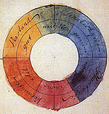
Ibn Sina (d. 1037), Nasir al-Din al-Tusi (d. 1274), and Robert Grosseteste (d. 1253) discovered that contrary to the teachings of Aristotle, there are multiple color paths to get from black to white.
[2][3] More modern approaches to color theory principles can be found in the writings of Leone Battista Alberti (c. 1435) and the notebooks of Leonardo da Vinci (c. 1490).
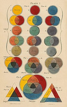
Charles Hayter published A New Practical Treatise on the Three Primitive Colours Assumed as a Perfect System of Rudimentary Information (London 1826), in which he described how all colors could be obtained from just three.
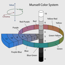
Subsequently, German and English scientists established in the late 19th century that color perception is best described in terms of a different set of primary colors—red, green and blue-violet (RGB)—modeled through the additive mixture of three monochromatic lights.
As a result, three-color printing became aesthetically and economically feasible in mass printed media, and the artists' color theory was adapted to primary colors most effective in inks or photographic dyes: cyan, magenta, and yellow (CMY).
Major advances were made in the early 20th century by artists teaching or associated with the German Bauhaus, in particular Wassily Kandinsky, Johannes Itten, Faber Birren and Josef Albers, whose writings mix speculation with an empirical or demonstration-based study of color design principles.
These confusions are partly historical and arose in scientific uncertainty about color perception that was not resolved until the late 19th century when artistic notions were already entrenched.
[citation needed] Ostensibly, any failure of specific paints or inks to match this ideal performance is due to the impurity or imperfection of the colorants.
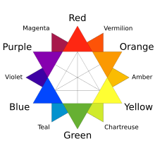
The split-primary palette is a color-wheel model that relies on misconceptions to attempt to explain the unsatisfactory results produced when mixing the traditional primary colors, red, yellow, and blue.
Rather, the appearance of any given colorant is inherent to its chemical and physical properties, and its purity unrelated to whether it conforms to our arbitrary conception of an ideal hue.
Although no set of three primary paints can be mixed to obtain the complete color gamut perceived by humans, red, yellow, and blue are a poor choice if high-chroma mixtures are desired.
Although flawed in principle,[10] the split-primary system can be successful in practice, because the recommended blue-biased red and green-biased blue positions are often filled by near approximations of magenta and cyan, respectively, while orange-biased red and violet-biased blue serve as secondary colors, tending to further widen the mixable gamut.
This system is in effect a simplified version of Newton's geometrical rule that colors closer together on the hue circle will produce more vibrant mixtures.
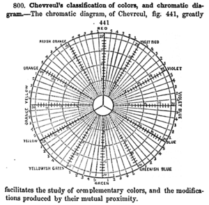
Chevreul formalized three types of contrast:[11] The distinction between "warm" and "cool" colors has been important since at least the late 18th century.
[12] The difference (as traced by etymologies in the Oxford English Dictionary), seems related to the observed contrast in landscape light, between the "warm" colors associated with daylight or sunset, and the "cool" colors associated with a gray or overcast day.
There is a historical disagreement about the colors that anchor the polarity, but 19th-century sources put the peak contrast between red-orange and greenish-blue.
These factors include individual differences (such as age, gender, personal preference, affective state, etc.)
The following conceptual model illustrates this 21st-century approach to color harmony: wherein color harmony is a function (f) of the interaction between color/s (Col 1, 2, 3, …, n) and the factors that influence positive aesthetic response to color: individual differences (ID) such as age, gender, personality and affective state; cultural experiences (CE), the prevailing context (CX) which includes setting and ambient lighting; intervening perceptual effects (P) and the effects of time (T) in terms of prevailing social trends.
[18] In addition, split complementary color schemes usually depict a modified complementary pair, with instead of the "true" second color being chosen, a range of analogous hues around it are chosen, i.e. the split complements of red are blue-green and yellow-green.
Feisner and Mahnke are among a number of authors who provide color combination guidelines in greater detail.
Such formulae and principles may be useful in fashion, interior and graphic design, but much depends on the tastes, lifestyle, and cultural norms of the viewer or consumer.
Such color associations tend to be learned and do not necessarily hold irrespective of individual and cultural differences or contextual, temporal or perceptual factors.