Janson
Janson is the name given to a set of old-style serif typefaces from the Dutch Baroque period, and modern revivals from the twentieth century.
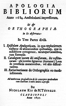
In 1954 Harry Carter and George Buday published an essay asserting that the designer of the Janson typeface was in fact a Hungarian-Transylvanian schoolmaster and punchcutter, Miklós (Nicholas) Tótfalusi Kis (1650–1702).
[5][8][9] He developed a second career as a punchcutter, an engraver of the punches used as a master for stamping matrices for casting metal type, selling his work to printers in the Netherlands and abroad.
The style he worked in was based on French serif typefaces of the previous century, but with boosted x-height and higher stroke contrast, creating a higher-contrast, sharper effect.
[15][16][17] Kis's identity as the maker of the typefaces was rediscovered in the 1950s by comparison with type from Hungarian archive sources (including his autobiography) on which his name was identified.
In his book Printing Types: Their History, Forms and Uses, Updike commented that "although heavy, they retain considerable vivacity of line and have great capabilities when used with taste.
Griffith was a great admirer of the Janson designs, writing to Carl Rollins of Yale University Press that "I am so anxious to have the Linotype face worthy of its name.