Kruithof curve
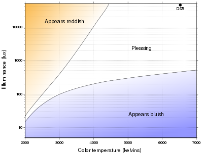
The Kruithof curve describes a region of illuminance levels and color temperatures that are often viewed as comfortable or pleasing to an observer.
At typical indoor office illuminance levels of about 400 lux,[citation needed] pleasing color temperatures are lower (between 3000 and 6000 K), and at typical home illuminance levels of about 75 lux,[citation needed] pleasing color temperatures are even lower (between 2400 and 2700 K).
The pleasing region of the curve contains color temperatures and illuminance levels comparable to naturally lit environments.
[6] Using gas-discharge fluorescent lamps, Kruithof was able to manipulate the color of emitted light and ask observers to report as to whether or not the source was pleasing to them.
While the curve has been used as a guide to design artificial lighting for indoor spaces, with the general suggestion to use sources with low correlated color temperatures (CCT) at low illuminances,[8] Kruithof did not describe the method of evaluation, the independent variables, nor the test sample that were used to develop the curve.
This lacunae in the data is particularly important as it relates to almost all "lifestyle" environments in which lighting designers operate - hotels, restaurants and residential settings.
The Kruithof curve, as presented, does not contain experimental data points and serves as an approximation for desirable lighting conditions.
Many fluorescent lamps or LED light bulbs have spectrums that do not match those of Planckian blackbodies and are considered unnatural.
The illuminance of a source is the dominating factor for deciding as to whether or not a source is pleasing or comfortable, as viewers participating in this experiment evaluated a range of correlated color temperatures and illuminance levels, yet their impressions remained generally unchanged as correlated color temperature changed.