MACD
MACD, short for moving average convergence/divergence, is a trading indicator used in technical analysis of securities prices, created by Gerald Appel in the late 1970s.
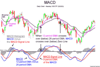
[1] It is designed to reveal changes in the strength, direction, momentum, and duration of a trend in a stock's price.
The reason was the lack of the modern trading platforms which show the changing prices every moment.
Although the MACD and average series are discrete values in nature, but they are customarily displayed as continuous lines in a plot whose horizontal axis is time, whereas the divergence is shown as a bar chart (often called a histogram).
By comparing EMAs of different periods, the MACD series can indicate changes in the trend of a stock.
The formula for the MACD line is based on two exponential moving averages of the close prices, usually with the periods of 12 and 26:[5]
Exponential moving averages highlight recent changes in a stock's price.
By comparing EMAs of different lengths, the MACD series gauges changes in the trend of a stock.
The difference between the MACD series and its average is claimed to reveal subtle shifts in the strength and direction of a stock's trend.
Significance is also attributed to disagreements between the MACD line or the difference line and the stock price (specifically, higher highs or lower lows on the price series that are not matched in the indicator series).
A "signal-line crossover" occurs when the MACD and average lines cross; that is, when the divergence (the bar graph) changes sign.
A false negative would be a situation where there is bearish crossover, yet the stock accelerated suddenly upwards.
A prudent strategy may be to apply a filter to signal line crossovers to ensure that they have held up.
As with any filtering strategy, this reduces the probability of false signals but increases the frequency of missed profit.
A MACD crossover of the signal line indicates that the direction of the acceleration is changing.
The MACD line crossing zero suggests that the average velocity is changing direction.