Otl Aicher
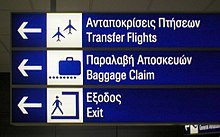
He is known for having led the design team of the 1972 Summer Olympics in Munich, and for overseeing the creation of its prominently used system of pictograms.
[1] Faculty and students included such notable designers as Tomás Maldonado, Peter Seitz, and Anthony Froshaug.
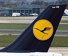
[2] Among others, he was influential in the corporate identity of the company Braun, and he designed the logo for the German airline Lufthansa in 1969.
[3] Basing his work in part on iconography for the 1964 Games, Aicher created a set of pictograms meant to provide a visual interpretation of the sport they featured so that athletes and visitors to the Olympic village and stadium could find their way around.
[3] He created pictograms using a series of grid systems and a specific bright colour palette that he chose for these Games.
One of their first ideas was to use an element of the city's coat of arms or Münchner Kindl within the design which showed a monk or child pointing into the distance while clasping a book in his hand.
[3] Finally the "Strahlenkranz" was created, a garland which represented the sun but also the five Olympic rings merged in a spiral shape.
The mountains in blue and white would make up the palette of colours which also included green, orange and silver.
Uniforms were colour-coordinated to represent these themes, the Olympic staff could be identified as working for a particular department by the colour they were wearing.
He created the Rotis font family in 1988, naming it after the location of his domicile and design studio near the rural town of Leutkirch im Allgäu.