Rail Alphabet
First used at Liverpool Street station, it was then adopted by the Design Research Unit (DRU) as part of their comprehensive 1965 rebranding of the company.
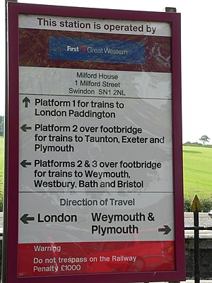
Rail Alphabet is similar to a bold weight of Helvetica, but with some differences in character shapes,[3] stroke width and x-height to aid legibility.
The subsequent creation of Rail Alphabet was intended to provide a style of lettering more specifically suited to stations where it would primarily be viewed indoors by pedestrians.
[6] The Design Research Unit's 1965 rebranding of British Railways included a new logo (the double arrow), a shortened name British Rail, and the total adoption of Rail Alphabet for all lettering other than printed matter[7] including station signage, trackside signs, fixed notices, signs inside trains and train liveries.
Key elements of the rebranding were still being used during much of the 1980s and Rail Alphabet was also used as part of the livery of Sealink ships until that company's privatisation in the late 1980s.
[8] The typeface remained in near-universal use for signs at railway stations but began to be replaced with alternatives in other areas, such as in InterCity's 1989 Mark 4 passenger carriages which made use of Frutiger for much of their interior signage.
More recently, the custom Brunel typeface introduced by Railtrack for signs at major stations and adapted by Network Rail as NR Brunel was recommended as a new national standard for station signs by a 2009 report commissioned by the Secretary of State for Transport,[9] and was used extensively by South West Trains and East Midlands Trains.
[18] The redesign also includes new pictograms to depict services and facilities which did not exist in the 1960s when the original typeface was conceived – such as gender neutral toilets and vaping areas.