Wood type
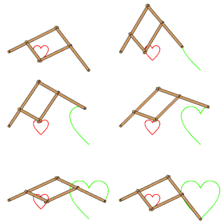
In the 1820s, Darius Wells introduced mechanised wood type production using the powered router, and William Leavenworth in 1834 added a second major innovation of using a pantograph to cut a letter's shape from a pattern.
[14][12] Manufacturing, selecting and redistributing sorts for a large character set was cumbersome, and much printing in China continued to be made from custom-cut woodblocks of entire pages of text, rather than from movable type.
[22] With care, it was possible to duplicate woodblocks by casting in sand, a technique known to have been used by Hendrik van den Keere to create his large types.
[26] In 1810, William Caslon IV introduced "sanspareil" matrices, made like a stencil by cutting out the letter in sheet metal and riveting it to a backing plate.
"[40] Modern wood type, mass-produced by machine cutting rather than hand-carved, was invented by Darius Wells (1800–1875), who published his first known catalogue in New York City in 1828.
[1][46][47] William Leavenworth in 1834 introduced the pantograph, allowing the same form to be reproduced from a pattern, and manufactured wood type in Allentown, New Jersey.
[56] The market for wood type was apparently limited and most businesses had side-lines as dealers in other printers' equipment, or making other wooden goods.
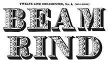
[58][59][60] Common type styles included the slab serif, fat face, sans-serif, reverse-contrast or "French Clarendon",[61] and other genres such as "Tuscan" (spikes on the letter), "Grecian" (chamfered)[62] and ornamented forms.
[63][64] (The use of fictitious adjective names for newly invented type styles was common with wood type manufacturers but not invented by them, for example in London Vincent Figgins had called his first slab-serif "Antique" around 1817 and the Caslon foundry's first reverse contrast typeface around 1821 was given the probably fictitious name "Italian".
[66][67] For Bethany Heck, "wood type in the US was pioneered by mad scientists who strained good taste and legibility in an attempt to cover the broadest range of ornament, width and weight".
[73] Digital typeface designer Anatole Couteau comments: "in wood type...due to how the wooden blocks are cut, spacing is typically so tight that you constantly have to do kerning.
[80] Besides this, American manufacturers made German blackletter, Greek and Hebrew types catering to the large immigrant communities.
Reproductions of wood type with their resonance of times past were offered by phototypesetting companies such as Photo-Lettering Inc. and Haber Typographers, and used in the 1960s by designers such as Bob Cato and John Berg,[108] and later Paula Scher and Louise Fili.
[112][113][114] (For wood type historian Rob Roy Kelly, the aesthetic quality of wood type manufacturers declined in the twentieth century; Nick Sherman and Frode Helland have commented on a staggeringly bad rendition of Futura in Hamilton's 1951 specimen that features inconsistent stroke weights, the dot on the i and j at different heights, and the 8 in the specimen printed upside down.
This is because of its cinematic and decorative appearance: wood type style-lettering was very popular in Westerns giving it an association with the American west, and are used frequently to depict that aesthetic, from theme parks to bars.
[120][121] In the 1950s, Rob Roy Kelly, an American graphic design teacher, became interested in the history of wood type and built up a large collection from sources like old print shops and printers' families.
[127][128][129][130][131] Many digital fonts based on wood type display faces have been published, benefiting from the plentiful source material and accessibility of images, for example Kelly's book.


