Akzidenz-Grotesk
It was introduced by the London type-founder William Thorowgood as the name for sans-serifs in the specimen books of his Fann Street Foundry around 1830.
This gives a sense of simplicity and an absence of the adornment and flourishes seen in the more decorative sans-serifs of the late nineteenth century influenced by the Art Nouveau style.
[11][12] Walter Tracy describes this style of 'g' as a common feature in German sans-serifs of the period and apparently influenced by the tradition of blackletter, still very popular for printing extended texts in Germany in the late nineteenth century, which uses a single-storey 'g' in upright composition.
[21] Sans-serifs had become very popular in Germany by the late nineteenth century, which had a large number of small local type foundries offering different versions.
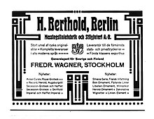
[22][11] H. Berthold was founded in Berlin in 1858 initially to make machined brass printer's rule, moving into casting metal type particularly after 1893.
[27][28] Recent research by Eckehart Schumacher-Gebler, Indra Kupferschmid and Dan Reynolds has clarified many aspects of Akzidenz-Grotesk's history.
[32][33][34] Early references to Akzidenz-Grotesk at Berthold often use the alternative spelling 'Accidenz-Grotesk'; Reynolds has suggested that the name may have been intended as a brand extension following on from an "Accidenz-Gothisch" blackletter face sold by the Bauer & Co.
[35][36] In general, Reynolds comments that the style of Schattierte Grotesk and Akzidenz-Grotesk "seem to me to be more of a synthesis of then-current ideas of sans serif letterform design, rather than copies of any specific products from other firms.
It apparently was cut by Berthold around 1902-3, when it was announced in a trade periodical as "a new, quite usable typeface" and advertised as having matching dimensions allowing it to be combined with the regular weight of Akzidenz-Grotesk.
[26][37][19][25] Reynolds and Florian Hardwig have documented the Schmalhalbfett weight (semi-bold, or medium, condensed) to be a family sold by many German type-foundries, which probably originated from a New York type foundry.
[41] This had been established by businessman and punchcutter Ferdinand Theinhardt, who was otherwise particularly famous for his scholarly endeavours in the field of hieroglyph and Syriac typefaces; he had sold the business in 1885.
[23][45][46][47][48][26][20][33][49] Reynolds additionally points out that Theinhardt sold his foundry to Oskar Mammen and Robert and Emil Mosig in 1885, a decade before Akzidenz-Grotesk was released, and there is no evidence that he cut any further fonts for them after this year.
[44] As Lange commented, it was claimed in the post-war period that Royal-Grotesk's name referred to it being commissioned by the Prussian Academy of Sciences, but Kupferschmid was not able to find it used in its publications.
[3][50] Its competitors included the very popular Venus-Grotesk of the Bauer foundry of Frankfurt, very similar to Akzidenz-Grotesk but with high-waisted capitals, and Koralle by Schelter & Giesecke, which has a single-storey 'a'.
[58][59][60] The use of Akzidenz-Grotesk and similar "grotesque" typefaces dipped from the late 1920s due to the arrival of fashionable new "geometric" sans-serifs such as Erbar, Futura and Kabel, based on the proportions of the circle and square.
In 1923 Tschichold converted to Modernist design principles after visiting the first Weimar Bauhaus exhibition at the Haus am Horn, where he was introduced to important artists such as László Moholy-Nagy, El Lissitzky, Kurt Schwitters and others carrying out radical experiments to break the rigid schemes of conventional typography.
[64] He became a leading advocate of Modernist design: first with an influential 1925 magazine supplement; then a 1927 personal exhibition; then with his most noted work Die neue Typographie in 1927.
[65] This book was a manifesto of modern design, in which he condemned all typefaces but Grotesk and praised the aesthetic qualities of the "anonymous" sans-serifs of the nineteenth century.
Most of them, in particular the newest designs such as Erbar and Kabel, are inferior to the old anonymous sans-serifs, and have modifications which place them basically in line with the rest of the "art" faces.
[14][15] Art historian Stephen Eskilson wrote that they "conveyed the functionalist ethos without appearing too stylised...in the manner of the more geometrically pure types.
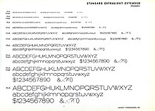
According to Paul Shaw, "exactly when Amsterdam Continental began importing Standard is unclear but it appears on several record album covers as early as 1957.
"[80][81][82] In 1957, three notable competitors of Akzidenz-Grotesk appeared intended to compete with its growing popularity: Helvetica from the Haas foundry, with a very high x-height and tight letterspacing, Univers from Deberny & Peignot, with a large range of weights and widths, and Folio from Bauer.
By the 1960s, Berthold could claim in its type specimens that Akzidenz-Grotesk was:a type series which has proved itself in practice for more than 70 years and has held its ground to the present day against all comers...wherever one sees graphics and advertising of an international standard...starting a revival in Switzerland in recent years, Akzidenz-Grotesk has progressed all over the world and impressed its image in the typography of our time.
[89] Separately, Gerstner and other designers at his company GGK Basel launched a project in the 1960s to build Akzidenz-Grotesk into a coherent series, to match the new families appearing in the same style; it was used by Berthold for its Diatype system in the late 60s under the name of "Gerstner-Programm" but according to Lange it was never fully released.
[96][97] Berthold Types' co-owner Harvey Hunt died in 2022,[98] and the rights to its typeface library were acquired by Monotype later that year.
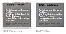
"[103] A particular criticism of Akzidenz-Grotesk however, has often been that the regular weight has capitals that look unbalanced relative to the lower-case, as shown on the cover of Designing Programmes, which is problematic in extended text.
Adrian Frutiger commented that Akzidenz-Grotesk forms "patches in print";[104] Reynolds that in a digital version "the capital letters are slightly too dark, and slightly too close to the lowercase letters that follow them in a word"[105] and Wolfgang Homola that in Helvetica "the weight of the stems of the capitals and the lower case is better balanced".
Miedinger sought to refine the typeface making it more even and unified, with a higher x-height, tighter spacing and generally horizontal terminals.
[130][131] Much more loosely, Transport, the typeface used on British road signs, was designed by Jock Kinneir and Margaret Calvert influenced by Akzidenz-Grotesk.
[139][140][141] Besides use in Swiss-style poster design and in New York City transportation, Akzidenz-Grotesk is the corporate font of Arizona State University[158] and the American Red Cross (with Georgia).