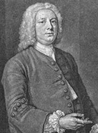
Caslon
Caslon worked as an engraver of punches, the masters used to stamp the moulds or matrices used to cast metal type.
Caslon established a tradition of engraving type in London, which previously had not been common, and was influenced by the imported Dutch Baroque typefaces that were popular in England at the time.
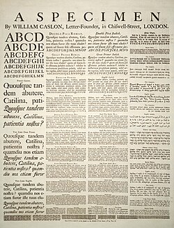
[4][5][6][7] His typefaces established a strong reputation for their quality and their attractive appearance, suitable for extended passages of text.
[8][9] The letterforms of Caslon's roman, or upright type include an "A" with a concave hollow at top left and a "G" without a downwards-pointing spur at bottom right.
[11] Ascenders and descenders are relatively short and the level of stroke contrast is modest in body text sizes.
Caslon would later follow this practice, according to Nichols teaching his son his methods privately while locked in a room where nobody could watch them.
Caslon's pica replaces it in his printing from 1725…Caslon's Great Primer roman, first used in 1728, a type that was much admired in the twentieth century, is clearly related to the Text Romeyn of Voskens, a type of the early seventeenth century used by several London printers and now attributed to the punch-cutter Nicolas Briot of Gouda.
[4][26][27][28] Caslon's type rapidly built up a reputation for workmanship, being described by Henry Newman in 1733 as "the work of that Artist who seems to aspire to outvying all the Workmen in his way in Europe, so that our Printers send no more to Holland for the Elzevir and other Letters which they formerly valued themselves much.
And yet it is so soundly made that words that are set in it keep their shape and are comfortably readable...It is a type that works best in the narrow measure of a two-column page or in quite modest octavos.
[17] He publicised his type through contributing a specimen sheet to Chambers' Cyclopedia, which has often been cut out by antiquarian book dealers and sold separately.
[34] After William Caslon I’s death, the use of his types diminished, but had a revival between 1840–80 as a part of the British Arts and Crafts movement.
[14] One criticism of some Caslon-style typefaces has been a concern that the capitals are too thick in design and stand out too much, making for an uneven colour on the page.
[36] Caslon's types fell out of interest in the late eighteenth century, to some extent first due to the arrival of "transitional"-style typefaces like Baskerville and then more significantly with the growing popularity of "Didone" or modern designs in Britain, under the influence of the quality of printing achieved by printers such as Bodoni.
[39][18][d] His Caslon foundry remained in business at Chiswell Street, London, but began to sell alternative and additional designs.
[40][41] His grandson, William Caslon III, broke away from the family to establish a competitor foundry at Salisbury Square, by buying up the company of the late Joseph Jackson.
[49] (Bookman Old Style is a descendant of this typeface, but made bolder with a boosted x-height very unlike the original Caslon.
[49]) The Caslon foundry covertly replaced some sizes with new, cleaner versions that could be machine-cast and cut new swash capitals.
[51] The hot metal typesetting companies Linotype, Monotype, Intertype and Ludlow, which sold machines that cast type under the control of a keyboard, brought out their own Caslon releases.
[54] Scholarly research on Caslon's type has been carried out by historians including Alfred F. Johnson, Harry Carter, James Mosley and Justin Howes.
Smith took over the company and instructed his sons to change their surnames to Caslon in order to provide an appearance of continuity.
[56] Howes describes these as "based rather closely on François Guyot's [popular 22pt] italic of around 1557...found in English printing until the early years of the eighteenth century.
"[3] From around 1893 the company started to additionally recut some letters to make the type more regular and create matrices which could be cast by machine.
[59] The italic was distributed by Letraset with a matching set of swashes, as a result revivals of this typeface are sometimes sold without a regular style (see below).
Despite the name, it has no connection to Caslon: it was an import of the French typeface "Le Moreau-le-Jeune", created by Fonderie Peignot in Paris as part of their Cochin family, by ATF branch Barnhart Brothers & Spindler.
Like many ITC families, they have an aggressive, advertising-oriented bold structure, not closely related to Caslon's original work.
[87][88] The standard weight is bundled with Apple's macOS operating system in a release including small caps and alternates such as the long s. Initially published by his company Carter & Cone, in 2014 Carter revisited the design adding bold and black designs with matching italics, and republished it through Font Bureau.
The weight is heavier than many earlier revivals, to compensate for changes in printing processes, and the italic is less slanted (with variation in stroke angle) than on many other Caslon releases.
A number of Caslon revivals are "distressed" in style, adding intentional irregularities to capture the worn, jagged feel of metal type.
[105] Unlike previous digital revivals, this family closely follows the tradition of building separate typefaces intended for different sizes.
Distressing varies by style, matching the effect of metal type, with large optical sizes offering the cleanest appearance.