Ligature (writing)
Merchants especially needed a way to speed up the process of written communication and found that conjoining letters and abbreviating words for lay use was more convenient for record keeping and transaction than the bulky long forms.
[citation needed] In handwriting, a ligature is made by joining two or more characters in an atypical fashion by merging their parts, or by writing one above or inside the other.
Ligatures made printing with movable type easier because one sort would replace frequent combinations of letters and also allowed more complex and interesting character designs which would otherwise collide with one another.
Ligature use fell as the number of traditional hand compositors and hot metal typesetting machine operators dropped because of the mass production of the IBM Selectric brand of electric typewriter in 1961.
"[5] Ligatures have grown in popularity in the 21st century because of an increasing interest in creating typesetting systems that evoke arcane designs and classical scripts.
Mrs Eaves by Zuzana Licko contains a particularly large set to allow designers to create dramatic display text with a feel of antiquity.
This has caused the development of new digital typesetting techniques such as OpenType, and the incorporation of ligature support into the text display systems of macOS, Windows, and applications like Microsoft Office.
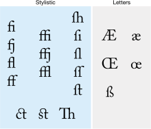
An increasing modern trend is to use a "Th" ligature which reduces spacing between these letters to make it easier to read, a trait infrequent in metal type.
[6][7][8] Today, modern font programming divides ligatures into three groups, which can be activated separately: standard, contextual and historical.
In Linotype, ligature matrices for ⟨fa⟩, ⟨fe⟩, ⟨fo⟩, ⟨fr⟩, ⟨fs⟩, ⟨ft⟩, ⟨fb⟩, ⟨fh⟩, ⟨fu⟩, ⟨fy⟩, and for ⟨f⟩ followed by a full stop, comma, or hyphen are optional in many typefaces, [9] as well as the equivalent set for the doubled ⟨ff⟩, as a method to overcome the machine's physical restrictions.
[citation needed] These arose because with the usual type sort for lowercase ⟨f⟩, the end of its hood is on a kern, which would be damaged by collision with raised parts of the next letter.
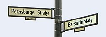
[citation needed] Ligatures crossing the morpheme boundary of a composite word are sometimes considered incorrect, especially in official German orthography as outlined in the Duden.
Since the end of 2010, the Ständiger Ausschuss für geographische Namen (StAGN) has suggested the new upper case character for "ß" rather than replacing it with "SS" or "SZ" for geographical names.
[citation needed] The character ⟨Æ⟩ (lower case ⟨æ⟩; in ancient times named æsc) when used in Danish, Norwegian, Icelandic, or Old English is not a typographic ligature.
[citation needed] In modern English orthography, ⟨Æ⟩ is not considered an independent letter but a spelling variant, for example: "encyclopædia" versus "encyclopaedia" or "encyclopedia".
In this use, ⟨Æ⟩ comes from Medieval Latin, where it was an optional ligature in some specific words that had been transliterated and borrowed from Ancient Greek, for example, "Æneas".
It is still found as a variant in English and French words descended or borrowed from Medieval Latin, but the trend has recently been towards printing the ⟨A⟩ and ⟨E⟩ separately.
Phone books treat umlauted vowels as equivalent to the relevant digraph (so that a name Müller will appear at the same place as if it were spelled Mueller; German surnames have a strongly fixed orthography, either a name is spelled with ⟨ü⟩ or with ⟨ue⟩); however, the alphabetic order used in other books treats them as equivalent to the simple letters ⟨a⟩, ⟨o⟩ and ⟨u⟩.
The convention in Scandinavian languages and Finnish is different: there the umlaut vowels are treated as independent letters with positions at the end of the alphabet.
[19] Before the replacement of the older "aa" with "å" became a de facto practice, an "a" with another "a" on top (aͣ) could sometimes be used, for example in Johannes Bureus's, Runa: ABC-Boken (1611).
This ligature is still seen today on icon artwork in Greek Orthodox churches, and sometimes in graffiti or other forms of informal or decorative writing.
[citation needed] The International Phonetic Alphabet formerly used ligatures to represent affricate consonants, of which six are encoded in Unicode: ʣ, ʤ, ʥ, ʦ, ʧ and ʨ.
[citation needed] Rarer ligatures also exist, including ⟨ꜳ⟩; ⟨ꜵ⟩; ⟨ꜷ⟩; ⟨ꜹ⟩; ⟨ꜻ⟩ (barred ⟨av⟩); ⟨ꜽ⟩; ⟨ꝏ⟩, which is used in medieval Nordic languages for /oː/ (a long close-mid back rounded vowel),[21] as well as in some orthographies of the Massachusett language to represent uː (a long close back rounded vowel); ᵺ; ỻ, which was used in Medieval Welsh to represent ɬ (the voiceless lateral fricative);[21] ꜩ; ᴂ; ᴔ; and ꭣ have Unicode codepoints (in code block Latin Extended-E for characters used in German dialectology (Teuthonista),[22] the Anthropos alphabet, Sakha and Americanist usage).
[citation needed] Similarly, the number sign ⟨#⟩ originated as a stylized abbreviation of the Roman term libra pondo, written as ℔.
One theory says that the French word à (meaning at), was simplified by scribes who, instead of lifting the pen to write the grave accent, drew an arc around the "a".
Sans serif uppercase ⟨IJ⟩ glyphs, popular in the Netherlands, typically use a ligature resembling a ⟨U⟩ with a broken left-hand stroke.
In Chinese these units are disyllabic and standardly written with two characters, as 厘米 límǐ "centimeter" (厘 centi-, 米 meter) or 千瓦 qiānwǎ "kilowatt".
In OpenType, there are standard liga, historical hlig, contextual clig, discretionary dlig and required rlig ligatures.
For example, ligatures such as æ and œ are not used to replace arbitrary "ae" or "oe" sequences; it is generally considered incorrect to write "does" as "dœs".)
[54] Croatian designer Maja Škripelj also created a ligature that combined Glagolitic letters ⰘⰓ for euro coins.