Chromoxylography
Chromoxylography (/ˌkroʊmoʊzaɪˈlɒɡrəfi/) was a colour woodblock printing process, popular from the mid-19th to the early-20th century, commonly used to produce illustrations in children's books, serial pulp magazines, and cover art for yellow-back and penny dreadfuls.
[5] Gascoigne explains that the process required a "master craftsman [to sit] with an original painting in front of him and work out which areas of the image should be printed in which of the available colours to achieve the desired effect.
Overlapping diagonal lines were carved to create dot-like shapes on the surface that took less ink and resulted in paler tones.
When done correctly, the block's colour registers matched printed paper, although sometimes ink squash is visible along the edges of an illustration.
He writes that "an impossibly and perfect and delicate area of crosshatching will suggest at first that the graver could not possibly have scooped out such small and regular interstices, but on closer inspection the lines in the two directions will be found to be of slightly different colours.
[3] The inexpensive technique of chromoxylography allowed publishers and printers to design covers as an attraction to purchase the book.
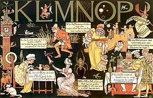
Evans considered full colour printing a technique well-suited to the simple illustrations in children's books.
[15] Evans reacted against crudely coloured children's book illustrations, which he believed could be beautiful and inexpensive if the print run was large enough to maintain the costs.