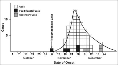
Epidemic curve
[3][4] Epidemic curves generally show the frequency of new cases compared to the date of disease onset.
Sometimes, cases could have been exposed days or weeks prior, and diseases with longer incubation periods would flatten these epidemic curves and lower the peaks.
[5] The first description of epidemiological curves from the COVID-19 pandemic showed the pattern of a "mixed outbreak".
According to the investigators, there was likely a continuous common source outbreak at Wuhan Seafood Market in December 2019, potentially from several zoonotic events.
[6] The New York Times has published a curve simulator for both the US and the world, on which the visitor can tinker the base parameters to get various outcomes.