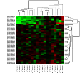
Heat map
A heat map (or heatmap) is a 2-dimensional data visualization technique that represents the magnitude of individual values within a dataset as a color.
The idea for joining cluster trees to the rows and columns of the data matrix originated with Robert Ling in 1973.
Ling used overstruck printer characters to represent different shades of gray, one character-width per pixel.
Leland Wilkinson developed the first computer program in 1994 (SYSTAT) to produce cluster heat maps with high-resolution color graphics.
[citation needed] Software designer Cormac Kinney trademarked the term 'heat map' in 1991 to describe a 2D display depicting financial market information.
Heat maps are a way to analyze a company's existing data and update it to reflect growth and other specific efforts.
Typically, there are multiple heat maps used together to determine insight to a website on what are the best and worst performing elements on the page.
The use of heat maps make for a visually easy way to summarize findings and main components.
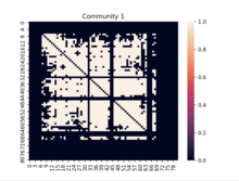
Heat maps in data analysis, allow for specific variables of rows and/or columns on the axes and even on the diagonal.
Heat maps are able to remove the tedious process and enable the user to visualize data points and compare amongst the different performers.
Possibly the largest reason is that when there is a large number of colors involved, the visualization may give off the impression that there exist gradients in the data that are not really present.
For example, if the data is to be printed in black and white or projected onto a large screen, it may be wise to adjust one's choice in color scheme.
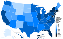
Choropleth maps show data grouped by geographic boundaries like countries, states, provinces or even floodplains.
Some heat maps that are created using approximated regional data may show familiar geographic borders in the visualization where none really exist.
Areas in rural parts of the United States and South America may closely resemble familiar geographic borders in those regions.