Jan van Krimpen
[6][7] His work has been described as traditional and classical in style, focusing on simplicity and high quality of book printing.
A visit to the Leipzig International Exhibition for Book Trade and Graphic Art (BuGra) (1914) awakened his taste for calligraphy, typography, bookbinding and type design.
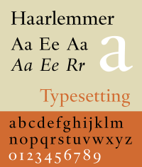
Van Krimpen's type designs are elegant book typefaces, originally made for manual printing and for the Monotype machine.
Van Krimpen was opposed to the idea of directly reviving type designs of the past, and his work is influenced by the structure of classical Roman square capitals in the upper case and chancery calligraphy of the Renaissance in italic.
From his perspective as a designer who had worked on types for newspapers and small-size printing, Tracy felt that van Krimpen's love of classical letterforms made his work sometimes interesting but often impractical for general use: "a person of knowledge, ability, and taste... the empirical attitude and the practical method were not, it seems, Van Krimpen's way... he worked from an inner vision, not from a broad view of practical realities and requirements."
[7] Van Krimpen had reservations about the quality of machine engraving of type punches and most of his designs were cut into metal by Enschedé's house punchcutter P.H.
"[14] Of special note is the Romulus 'superfamily', consisting of a seriffed font, a sloped roman, a chancery italic (Cancelleresca Bastarda), a sans-serif, and a Greek in a range of weights.
[16] These foundry types were designed by Jan van Krimpen:[17] Of this font, the first trial was made by Rädisch.
In the summer of 1929 van Krimpen was visited by Porter Garnett, the owner of the Laboratory Press in Pittsburgh.
Some initials designed by van Krimpen for the Curwen Press have also been digitised by ARTypes of Chicago.