Clarendon (typeface)
Mitja Miklavčič describes the basic features of Clarendon designs (and ones labelled Ionic, often quite similar) as: "plain and sturdy nature, strong bracketed serifs, vertical stress, large x-height, short ascenders and descenders, typeface with little contrast" and supports Nicolete Gray's description of them as a "cross between the roman [general-purpose body text type] and slab serif model".
Gray notes that nineteenth-century Ionic and Clarendon faces have "a definite differentiation between the thick and the thin strokes", unlike some other more geometric slab serifs.
Clarendon fonts proved extremely popular in many parts of the world, in particular for display applications such as posters printed with wood type.
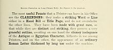
[11]) Compared to Figgins' "antique", the Clarendon design uses somewhat less emphatic serifs, which are bracketed rather than solid blocks, that widen as they reach the main stroke of the letter.
(The modern system of issuing typefaces in families with a companion bold of matched design did not develop until the twentieth century.
[12]) Slab serifs had already begun to be used for bold type by the 1840s, but they were often quite lumpy in design and quite poorly matched to the body text face they were intended to complement.
Historian Nicolete Gray considered the earlier "Ionic" face from the Caslon Foundry in the same style more effective than Besley's: "[Besley's] became the normal, but it was certainly not the first…in 1842 Caslon have an upper and in 1843 a lower case with the characteristics fully developed, but of a normal width…Besley's [more compressed] Clarendon is much less pleasing, it has lost emphasis and confidence, and gains only in plausibility.
By around 1874, the Fann Street Foundry (now Reed and Fox) could offer in its specimen book Clarendon designs that were condensed, "thin-faced" (light weight), extended, "distended" (extra-wide) and shaded.
[19][7][b] Millington notes that "Ionic became a distinct design in its own right" while Hoefler comments that it is now "chiefly associated with bracketed faces of the Century model".
[22] In addition, the market of slab serifs was disrupted by the arrival of new "geometric" slab-serifs inspired by the sans-serifs of the period, such as Beton and Memphis.
[23] However, a revival of interest did appear after the war both in America and Europe: Vivian Ridler commented that "What seemed pestiferous thirty years ago is now regarded as rugged, virile and essential for an advertising agency's self-respect.
[4] The original Clarendon became the property of Stephenson Blake in 1906, who marketed a release named Consort, cutting some additional weights (a bold and italics) in the 1950s.
[39] Intended to have less eccentric italics suitable for body text use, it was featured heavily in President Barack Obama's 2012 campaign website advertisements.
)[47][48] Intended as attention-grabbing novelty display designs rather than as serious choices for body text, within four years of their introduction the printer Thomas Curson Hansard had described them as 'typographic monstrosities'.
[50] A variety of adaptations have been made of the style, Robert Harling's Playbill and more recently Adrian Frutiger's Westside, URW++'s Zirkus and Bitstream's P. T.
Many modern writers as a result ignore them and prefer the term slab-serif, providing individual descriptions of the features of specific designs.
Craw Clarendon Bold was used by the United States National Park Service on traffic signs,[57] but has been replaced by NPS Rawlinson Roadway.
[58] This was however drawn within the Swindon drawing office, not by a type foundry, and this 'Swindon Egyptian' differed in some aspects, most obviously the numerals used for the cabside numberplates.