Red states and blue states
Traditional political mapmakers, at least throughout the 20th century, had used blue to represent the modern-day Republicans, as well as the earlier Federalist Party.
[5] However, at that time, a maker of widely sold maps accompanied them with blue pencils to mark Confederate force movements, while red was for the Union.
[6] Later, in the 1888 presidential election, Grover Cleveland and Benjamin Harrison used maps that coded blue for the Republicans, the color perceived to represent the Union and "Lincoln's Party", and red for the Democrats.
There was one historical use, associated with boss rule, of blue for Democrats and red for Republicans: during the late 19th century and early 20th century, Texas county election boards used color-coding to help Spanish-speaking and illiterate voters identify the parties;[7] however, this system was not applied consistently in Texas and was not replicated in any other state.
In 1908, The New York Times printed a special color map, using blue for Democrats and yellow for Republicans, to detail Theodore Roosevelt's 1904 electoral victory.
[1] According to The Washington Post, journalist Tim Russert invented these terms during his televised coverage of the 2000 United States presidential election.
[14] The 2000 election was not the first during which the news media used colored maps to depict voter preferences in the various states, but it was the first time the current red-blue terminology was used.
It further claims that from 1976 to 2004, in an attempt to avoid favoritism in color-coding, the broadcast networks standardized the convention of alternating every four years between blue and red the color used for the incumbent president's party.
[9][15] According to another source, in 1976, John Chancellor, the anchorman for NBC Nightly News, asked his network's engineers to construct a large illuminated map of the United States.
[1] It was said that Roy Wetzel, then the newly minted general manager of NBC’s election unit, justified the color scheme of blue for Republicans and red for Democrats for a simple reason: "Great Britain.
[1] NBC newsman David Brinkley referred to the 1980 election map outcome showing Republican Ronald Reagan's 44-state landslide in blue as resembling a "suburban swimming pool".
In 1980, when John Anderson had a relatively well publicized campaign as an independent candidate, at least one network indicated provisionally that they would use yellow if he were to win a state.
After the results were final with the Republican George W. Bush winning, journalists stuck with the color scheme, as The Atlantic's December 2001 cover story by David Brooks entitled, "One Nation, Slightly Divisible", illustrated.
Thus, red and blue became fixed in the media and in many people's minds, despite the fact that the Democratic and Republican parties had not officially chosen colors.
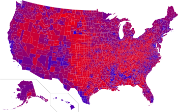
Popular vote data are necessarily aggregated at several levels, such as counties and states, which are then colored to show election results.
These "purple maps" are useful for showing the highly mixed nature of voting, but are extremely difficult to interpret in detail.
Many argue that assigning partisanship to states is only really useful as it pertains to the Electoral College, as well as (more recently) the Senate, primarily a winner-take-all system of elections (with the exceptions of Nebraska and Maine).
The converse can also be true, as in the case of Maine, which had two Republican U.S. senators, but Democratic presidential candidate John Kerry won the state's electoral votes.
Likewise, Vermont, New York, Massachusetts, Maryland, and Hawaii all voted for Democrat Kerry by wide margins, but all had Republican governors at the time.
The demographic and political applications of the terms have resulted in a temptation to presume this arbitrary classification is a definite and fundamental cultural division.
The analysis that suggests political, cultural and demographic differences between the states is more accurate when applied to smaller geographical areas.
Cartograms developed by Gastner, Shalizi, and Newman at the University of Michigan provide another way to depict election results,[32] which change from a red-blue paradigm to one of shades of purple.
Wisconsin, Pennsylvania and particularly Michigan voted in 2008 and 2012 for Obama handily, as well as having supported the Democratic nominee in every presidential election since 1988, suggesting they are gradually becoming redder.
[37][38] Nearly half of U.S. voters resided in counties that voted for George W. Bush or John Kerry by 20 percentage points or more in 2004.
They propose partition of the U.S. as a way of allowing both groups to achieve their policy goals while reducing the chances of civil war.
[47][48][49] Although the Electoral College determines the presidential election, a more precise measure of how the country actually voted may be better represented by either a county-by-county or a district-by-district map.
Georgia, Nevada, Pennsylvania, and Wisconsin, all states Biden won statewide, are good examples of this with some exceptions.
An even more detailed precinct-by-precinct breakdown demonstrates that in many cases, large cities voted for Biden, and their suburbs were divided.
The Democratic Congressional Campaign Committee also alluded to the color scheme when it launched a national "Red to Blue Program" in 2006.
For example, the major center-right conservative parties in the United Kingdom, Canada, Australia, New Zealand, Brazil, Italy, Spain, France and Bavaria, all use blue or its shades (whether officially or unofficially) whereas the major socialist, communist, or social democratic parties in each country are associated with red (orange in Canada).