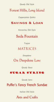
List of typefaces designed by Frederic Goudy
[3] This means that several of his most famous designs such as Copperplate Gothic and Goudy Stout are unusual deviations from his normal style.
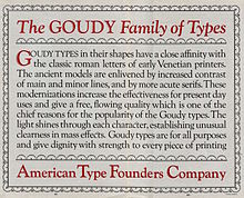
[4] Goudy's taste matched a trend of the period, in which a preference for using mechanical, geometric Didone fonts introduced in the eighteenth and nineteenth century was being displaced by a revival of interest in the 'old-style' serif fonts (preferred by Goudy) developed before this, a change that has proved to be lasting, especially in book body text.
[14] This gave much cleaner results than pre-pantograph punches, which had to be carefully hand-carved at the size of the desired letter, with less difficulty and the ability to prepare designs more easily from large plan drawings.
[16][17] His sans-serif series, Goudy Sans, adopts an eccentric humanist style with a calligraphic italic.
[18][19] Quite unlike most sans-serif types of the period, it was unpopular in his lifetime but has been revived several times since by both LTC and ITC.
[20][21][22] Goudy started his career as a full-time type designer later in life, creating his first font in his early thirties.
[30] Walter Tracy, a leading historian of type design, devoted a section of his book Letters of Credit to a critical assessment of Goudy's work.
He noted as an example how his "Bertham" type, named in memory of his late wife ("Bertha M."),[31] was drawn and engraved in sixteen working days: "there cannot have been much time for the objective scrutiny which every design should undergo before it is allowed to emerge from the workshop."
This designation was common in Goudy's time; it is now avoided due to confusion with fonts intended for body text.
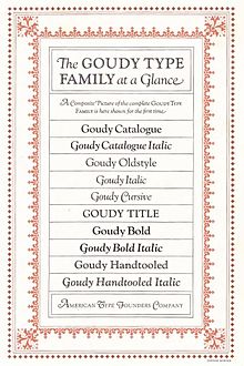
Links are given to digitisations, though it should be noted that many revivals may add complementary italics and/or bold weights, even if Goudy never designed one.
"[42] Others have compared it in some details, notably the tilted understroke on the 'e' of which Goudy was fond, to the type of late 15th century Venetian printer Nicolas Jenson.
Described as 'an instant best-seller' by Lawson in Anatomy of a Typeface, Goudy Old Style (1915) has remained popular since its creation for ATF as a body text and display face.
"[72] LTC's digitisation deliberately maintained its eccentricity and irregularity true to period printing, something Goudy had insisted on in his original design, avoiding perfect verticals.
After the original type was commissioned for private use, 'California' was released publicly by different companies, first in 1958, by Lanston Monotype as 'Californian' and then famously under the name of 'Berkeley Old Style' by ITC.
In digital versions, 'California' was released by ITC under its pre-existing brand, as 'Californian' by LTC and Font Bureau (in different digitisations) and by Richard Beatty under the name of 'University Old Style'.
For example, "Goudy Light" has been digitised by Red Rooster Fonts, a company who at time of writing sell it through the website MyFonts.