Whaam!
After entering training programs for languages, engineering, and piloting, all of which were canceled, he served as an orderly, draftsman and artist in noncombat roles.
[4] Around 1958 he began to incorporate hidden images of cartoon characters such as Mickey Mouse and Bugs Bunny into his abstract works.
[13] Regarding his use of imagery MoMA curator Bernice Rose observed that Lichtenstein was interested in "challenging the notion of originality as it prevailed at that time.
Public antipathy led in 1954 to examination of alleged connections between comic books and youth crime during Senate investigations into juvenile delinquency;[16] by the end of that decade, comic books were regarded as material of "the lowest commercial and intellectual kind", according to Mark Thistlethwaite of the Modern Art Museum of Fort Worth.
[18] Lichtenstein admitted he was "very excited about, and very interested in, the highly emotional content yet detached impersonal handling of love, hate, war, etc., in these cartoon images.
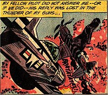
[31] The same issue of All-American Men of War was the inspiration for at least three other Lichtenstein paintings, Okay Hot-Shot, Okay!, Brattata and Blam, in addition to Whaam!
[33] Several of Lichtenstein's other comics-based works are inspired by stories about Johnny Flying Cloud written by Robert Kanigher and illustrated by Novick, including Okay Hot-Shot, Okay!, Jet Pilot and Von Karp.
was part of Lichtenstein's second solo exhibition at the Leo Castelli Gallery from 28 September to 24 October 1963, that also included Drowning Girl, Baseball Manager, In the Car, Conversation, and Torpedo...Los!
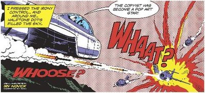
[46] Lichtenstein employs his usual comic-book style: stereotyped imagery in bright primary colors with black outlines, coupled with imitations of mechanical printer's Ben-Day dots.
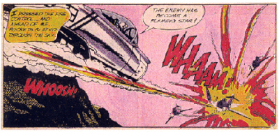
[42][43] Lichtenstein enlarged the main graphical subject of each panel (the plane on the left and the flames on the right), bringing them closer together as a result.
The paint was applied using a scrub brush and handmade metal screen to produce Ben-Day dots via a process that left physical evidence behind.
[25] The left panel features the attacking plane—placed at a diagonal to create a sense of depth—below the text balloon, which Lichtenstein has relegated to the margin above the plane.
", altered from the red in the original comic-book panel and white in the pencil sketch, links the yellow of the explosion below it with the textbox to the left and the flames of the missile below the attacking plane.
[61] Lichtenstein was attracted to using a cool, formal style to depict emotive subjects, leaving the viewer to interpret the artist's intention.
The borrowed technique was "representing tonal variations with patterns of colored circles that imitated the half-tone screens of Ben Day dots used in newspaper printing, and surrounding these with black outlines similar to those used to conceal imperfections in cheap newsprint.
According to O'Doherty, the result was "certainly not art, [but] time may make it so", depending on whether it could be "rationalized ... and placed in line for the future to assimilate as history, which it shows every sign of doing.
"[62] The Tate Gallery in London acquired the work in 1966, leading to heated argument amongst their trustees and some vocal members of the public.
[63] Some Tate trustees opposed the acquisition, among them sculptor Barbara Hepworth, painter Andrew Forge and the poet and critic Herbert Read.
[67] Keith Roberts, in a 1968 Burlington Magazine article, described the explosion as combining "art nouveau elegance with a nervous energy reminiscent of Abstract Expressionism".
[69] Steiner says the striking incongruity of the two panels—the left panel appearing to be "truncated", while the right depicts a centralized explosion—enhances the work's narrative power.
[69] Lichtenstein's technique has been characterized by Ernst A. Busche as "the enlargement and unification of his source material ... on the basis of strict artistic principles".
[60] David McCarthy contrasted Lichtenstein's "dispassionate, detached and oddly disembodied" presentation of aerial combat with the work of H.C. Westermann, for whom the experience of military service in World War II instilled a need to horrify and shock.
In contrast, Lichtenstein registers his "comment on American civilization" by scaling up inches-high comic book images to the oversized dimensions of history painting.
[3] Laura Brandon saw an attempt to convey "the trivialization of culture endemic in contemporary American life" by depicting a shocking scene of combat as a banal Cold War act.
[70] Carol Strickland and John Boswell say that by magnifying the comic book panels to an enormous size with dots, "Lichtenstein slapped the viewer in the face with their triviality.
presents "limited, flat colors and hard, precise drawing," which produce "a hard-edge subject painting that documents while it gently parodies the familiar hero images of modern America.
"[71] The flat and highly finished style of planned brushstrokes can be seen as pop art's reaction against the looseness of abstract expressionism.
[78][79] Andrew Edgar and Peter Sedgwick describe it, along with Warhol's Marilyn Monroe prints, as one of the most famous works of pop art.
Smart said the work was neither a positive commentary on the fighting American spirit nor a critique, but was notable for marking "Lichtenstein's incendiary impact on the US art scene".
at the Tate Modern, British comic book artist Dave Gibbons disputed Sooke's assertion that Lichtenstein's painting improved upon Novick's panel, saying: "This to me looks flat and abstracted, to the point of view that to my eyes it's confusing.