Emphasis (typography)
The most common methods in Western typography fall under the general technique of emphasis through a change or modification of font: italics, boldface and SMALL CAPS.
Other methods include the alteration of LETTER CASE and spacing as well as color and *additional graphic marks*.
With one or the other of these techniques (usually only one is available for any typeface), words can be highlighted without making them stand out much from the rest of the text (inconspicuous stressing).
This is used for marking passages that have a different context, such as book titles, words from foreign languages, or internal dialogue.
[3] Small capitals (THUS) are also used for emphasis, especially for the first line of a section, sometimes accompanied by or instead of a drop cap, or for personal names as in bibliographies.
In Japanese typography, due to the reduced legibility of heavier Minchō type, the practice remains common.
All-uppercase letters are a common substitute form of emphasis where the medium lacks support for boldface, such as old typewriters, plain-text email, SMS and other text-messaging systems.
[4] Coinciding with the era of typewriter use, the practice became unnecessary with the advent of computerized text formatting, although it is still found on occasion in documents created by older lawyers.
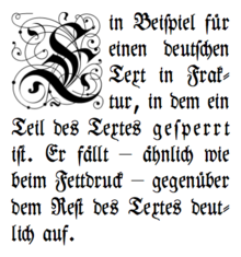
[5][6][7] Another means of emphasis is to increase the spacing between the letters, rather than making them darker, but still achieving a distinction in blackness.
Although letter-spacing was common, sometimes different typefaces (e.g. Schwabacher inside Fraktur), underlining or colored, usually red ink were used instead.
That means, ſt, ch, ck, and tz are still stuck together just as the letter ß, whereas optional, additional ligatures like ff and ſi are broken up with a (small) space in between.
[12] Professional Western typesetting usually does not employ lines under letters for emphasis within running text.
In proofreading, underlining (or underscoring) is a convention that says "set this text in italic type", traditionally used on manuscript or typescript as an instruction to the printer.
However, this clashes with the general understanding of how the marks are properly used, particularly scare quotes, and can leave the reader with a different impression than intended.
[18] Post-print emphasis added by a reader is often done with highlighters which add a bright background color to usual black-on-white text.
Professional typographic systems, including most modern computers, would therefore not simply tilt letters to the right to achieve italics (that is instead referred to as slanting or oblique), print them twice or darker for boldface, or scale majuscules to the height of middle-chamber minuscules (like x and o) for small-caps, but instead use entirely different typefaces that achieve the effect.
"[23] Many university researchers and academic journal editors advise not to use italics, or other approaches to emphasizing a word, unless essential, for example the Modern Language Association "discourages the use of italics in academic prose to emphasize or point, because they are unnecessary—most often, the unadorned words do the job without typographic assistance".
[24] Although emphasis is useful in speech, and so has a place in informal or journalistic writing, in academic traditions it is often suggested that italics are only used where there is a danger of misunderstanding the meaning of the sentence, and even in that case that rewriting the sentence is preferable; in formal writing the reader is expected to interpret and understand the text themselves, without the assumption that the precise intended interpretation of the author is correct.