Typeface
[1] Most typefaces include variations in size (e.g., 24 point), weight (e.g., light, bold), slope (e.g., italic), width (e.g., condensed), and so on.
As the range of typeface designs increased and requirements of publishers broadened over the centuries, fonts of specific weight (blackness or lightness) and stylistic variants (most commonly regular or roman as distinct from italic, as well as condensed) have led to font families, collections of closely related typeface designs that can include hundreds of styles.
In the 1890s, the mechanization of typesetting allowed automated casting of fonts on the fly as lines of type in the size and length needed.
A high-intensity light source behind the film strip projected the image of each glyph through an optical system, which focused the desired letter onto the light-sensitive phototypesetting paper at a specific size and position.
This photographic typesetting process permitted optical scaling, allowing designers to produce multiple sizes from a single font, although physical constraints on the reproduction system used still required design changes at different sizes; for example, ink traps and spikes to allow for spread of ink encountered in the printing stage.
For computer screens, where each individual pixel can mean the difference between legible and illegible characters, some digital fonts use hinting algorithms to make readable bitmaps at small sizes.
Both groups contain faces designed for setting large amounts of body text, and others intended primarily as decorative.
Many people generally find proportional typefaces nicer-looking and easier to read, and thus they appear more commonly in professionally published printed material.
[citation needed] For the same reason, GUI computer applications (such as word processors and web browsers) typically use proportional fonts.
So do text-only computer displays and third- and fourth-generation game console graphics processors, which treat the screen as a uniform grid of character cells.
Monospaced fonts are commonly used by computer programmers for displaying and editing source code so that certain characters (for example parentheses used to group arithmetic expressions) are easy to see.
Fonts designed for low-resolution displays, meanwhile, may avoid pure circles, fine lines and details a screen cannot render.
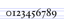
[23] Numbers can be typeset in two main independent sets of ways: lining and non-lining figures, and proportional and tabular styles.
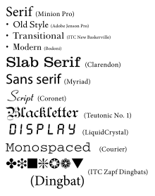
Serif fonts are often classified into three subcategories: Old Style, Transitional, and Didone (or Modern), representative examples of which are Garamond, Baskerville, and Bodoni respectively.
Transitional fonts exhibit a marked increase in the variation of stroke weight and a more horizontal serif compared to Old Style.
When first introduced, the faces were disparaged as "grotesque" (or "grotesk") and "gothic":[36] but by the late nineteenth century were commonly used for san-serif without negative implication.
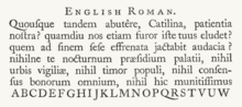
"Blackletter" is the name of the class of typefaces used with the earliest printing presses in Europe, which imitated the calligraphy style of that time and place.
Gaelic typefaces make use of insular letterforms, and early fonts made use of a variety of abbreviations deriving from the manuscript tradition.
[38][39] Various forms exist, including manuscript, traditional, and modern styles, chiefly distinguished as having angular or uncial features.
Most monospaced fonts are sans-serif or slab-serif as these designs are easiest to read printed small or display on low-resolution screens, though many exceptions exist.
Many display typefaces in the past such as those intended for posters and newspaper headlines were also only cut in capitals, since it was assumed lower-case would not be needed, or at least with no italics.
They do not lend themselves to quantities of body text, as people find them harder to read than many serif and sans-serif typefaces; they are typically used for logos or invitations.
The genre has developed rapidly in recent years due to modern font formats allowing more complex simulations of handwriting.
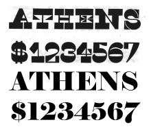
[54] Reverse-contrast types are rarely used for body text, and are particularly common in display applications such as headings and posters, in which their unusual structure may be particularly eye-catching.
An after-market shadow effect can be created by making two copies of each glyph, slightly offset in a diagonal direction and possibly in different colors.
Ink traps have remained common on designs intended to be printed on low-quality, absorbent paper, especially newsprint and telephone directories.
Greeking is used in typography to determine a typeface's colour, or weight and style, and to demonstrate an overall typographic aesthetic prior to actual type setting.
Historically complex interlocking patterns known as arabesques were common in fine printing, as were floral borders known as fleurons evoking hand-drawn manuscripts.
In the metal type era, type-founding companies often would offer pre-formed illustrations as fonts showing objects and designs likely to be useful for printing and advertisements, the equivalent of modern clip art and stock photographs.
[69][70] Following standardisation and inclusion in the Unicode standard, allowing them to be used internationally, the number of Emoji characters has rapidly increased to meet the demands of an expanded range of cultures using them; unlike many previous symbol typefaces, they are interchangeable with the ability to display the pictures of the same meaning in a range of fonts on different operating systems.