History of Western typography
Modern typographers view typography as a craft with a very long history tracing its origins back to the first punches and dies used to make seals and coinage currency in ancient times.
Typography, type-founding, and typeface design began as closely related crafts in mid-15th-century Europe with the introduction of movable type printing at the junction of the medieval era and the Renaissance.
[1] The scribal letter known as textur or textualis, produced by the strong gothic spirit of blackletter from the hands of German area scribes, served as the model for the first text types.
In 1476 William Caxton, having learned his craft on the Continent, printed the first books in England with a so-called Bâtarde type (an early Schwabacher design), but soon abandoned it.
[2] The early printers in Spain were Germans who began printing in contemporary roman types but soon gave these up and adopted Gothic typefaces based on the letterforms of Spanish manuscripts.
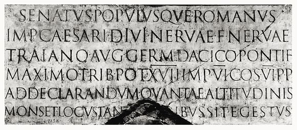
Their structurally perfect design, near-perfect execution in stone, balanced angled stressing, contrasting thick and thin strokes, and incised serifs became the typographic ideal for western civilization.
In their enthusiastic revival of classical culture, Italian scribes and humanist scholars of the early 15th century searched for ancient lower case letters to match the Roman inscriptional capitals.
[4] The classically endowed city of Rome attracted the first printers known to have set up shop outside Germany, Arnold Pannartz and Konrad Sweynheim, closely followed by the brothers Johann and Wendelin of Speyer (de Spira), and the Frenchman Nicolas Jenson.
Jenson adapted the structural unity and component-based modular integration of Roman capitals to humanistic minuscule forms by masterful abstract stylization.
As books printed with early roman types forced humanistic minuscule out of use, cursiva humanistica gained favor as a manuscript hand for the purpose of writing.
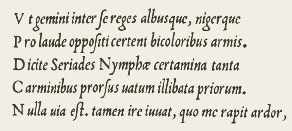
Griffo's punches are a delicate translation of the Italian cursive hand, featuring letters of irregular slant angle and uneven height and vertical position, with some connected pairs (ligatures), and unslanted small roman capitals the height of the lower case t. The fame of Aldus Manutius and his editions made the Griffo italic widely copied and influential, although it was not the finest of the pioneer italics.
Around 1527 the Vatican chancellery scribe Ludovico Arrighi designed a superior italic type and had the punches cut by Lauticio di Bartolomeo dei Rotelli.
Swiss art historian Jakob Burckhardt described the classically inspired Renaissance modello of dual case roman and cursive italic types as "The model and ideal for the whole western world".
Venetian pre-eminence in type design was brought to an end by the political and economic turmoil that concluded the Renaissance in Italy with the sack of Rome in 1527.
His principal type is wholly roman in the shape of the characters but retains an echo of gothic influence in the angled serifs and the way the thick and thin strokes are organized; it was coupled with mated sets of woodcut initials (often designed by distinguished artists) and with two larger sizes of uppercase letters for use in title pages and headings—Froben was the first to use such 'display typefaces' consistently, breaking away from the Italian tradition in which title pages and headings tended to be set in the same size as the main text.
Typography was introduced to France by the German printers Martin Crantz, Michael Freyburger and Ulrich Gering, who set up a press in Paris in 1470, where they printed with an inferior copy of the Lactantius type.
In the 16th century, Western printers also developed Oriental types, such as François Savary de Brèves or Robert Granjon, usually with the objective of proselytizing the Catholic faith.
[7] Baroque and rococo aesthetic trends, use of the pointed-pen for writing, and steel engraving techniques effected a gradual shift in typographic style.
The roman types used c. 1618 by the Dutch printing firm of Elzevir in Leyden reiterated the 16th-century French style with higher contrast, less rigor and a lighter page effect.
The so-named Fell types, presumed to be the work of Dutch punchcutter Dirck Voskens, mark a noticeable jump from previous designs, with considerably shorter extenders, higher stroke contrast, narrowing of round letters, and flattened serifs on the baseline and descenders.
It was the dominant type in the thirteen American colonies of British America (introduced by Benjamin Franklin) for the second half of the 18th century and was used for the United States Declaration of Independence.
Fleischmann's capitals were a new variety; an even-width scheme, compressed rounds, all-vertical stressing, and triangular beak ends of E F L T and Z, all characteristics prefiguring the "classical" moderns of Bodoni and Didot.
Fournier also published a two volume Manuel Typographique, in which he recorded much European typographic history, and introduced the first standardized system of type size measurement—the "point".
Baskerville was a meticulous artist who controlled all aspects of his creation, devising more accurate presses, blacker inks and paper sealed with hot rollers to ensure crisp impressions.
Completing trends begun by the Fell types, Fleischman, Fournier and Baskerville, the so-called "classical" modern romans eschewed chirographic and organic influences, their synthetic symmetric geometry answering to a rationalized and reformed classical model driven by the strict cartesian grid philosophy of René Descartes and the predictable clockwork universe of Isaac Newton.
The Spanish designer Joaquín Ibarra's roman was influenced by Baskerville, Didot and Bodoni, but hewn nearer to old-style and used in the same classical manner, including spaced capitals.
Essentially this movement initiated three things: a return to the antiqua-models of the Renaissance, clarity and simplicity of book illustrations, and straightforward technical processes during the production of printed matters.
The young type designers of the pre-war era, among them Fritz Helmuth Ehmcke and Friedrich Wilhelm Kleukens, rejected both the late typographical classicism and the ornaments of the popular art nouveau.
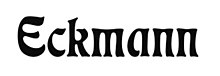
Walter Tiemann in Leipzig, Friedrich Hermann Ernst Schneidler in Stuttgart, and Rudolf Koch in Offenbach as instructors were the mentors of this kind of typography.
Jan Tschichold, the creator of one of many definitions and the most known theoretician of avant-garde typography stated that its basic rules should be lack of symmetry, contrast and total freedom of creation.