Button (computing)
The sole requirement of button interaction is that the user can execute a command by a click action.
[3] These buttons will show a graphical clue (such as staying depressed after the mouse is released) to indicate the state of the option.
The tooltip serves as built-in documentation that briefly explains the purpose of the button.
The button with keyboard focus (selectable with the spacebar) appears with a blue glow surrounding it.
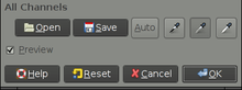
Also used, primarily within application toolbars, are slightly rounded rectangles with a light grey metallic appearance.
In addition, more recent versions, the default button is shown with a blue border.
Most widget toolkits also have theming capabilities, so there is no single standard appearance as there is with Mac OS and Windows.