Checkbox
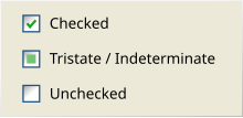
Checkboxes are shown as empty boxes when unchecked, and with a tick or cross inside (depending on the graphical user interface) when checked.
Inverting the state of a checkbox is done by clicking the mouse on the box, or the caption, or by using a keyboard shortcut, such as the space bar.
This is contrasted with the radio button, in which only a single option is selectable from several mutually-exclusive choices.
Checkboxes may be disabled (indicated "greyed out") to inform the user of their existence and possible use despite momentary unavailability.
[1][2][clarification needed] One common exception is to enable or display additional user input elements whose relevance depends on the checkbox state.