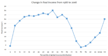
The Elephant Curve
The graph was first published by Christoph Lakner and Branko Milanovic in 2013 as part of a larger article called “Global Income Distribution: From the Fall of the Berlin Wall to the Great Recession”.
[2] From this information, they created a number of graphs to illustrate their findings, one of which they called the GICs, or growth incidence curves.
Lakner and Milanovic described the global growth incidence curve as “a distinct supine S shape, with gains at the very top and one in the middle.
[1] Beginning with the tail portion of the graph, in the past two decades the very poorest citizens of the world have experienced almost no benefits from the rise of globalization.
[3] Since the elephant curve's creation in 2013, there have been a number of adapted versions that have been created to illustrate the global income inequality through different methods.
One adaptation was created in 2018 by Alvaredo Facundo, Lucas Chancel, Thomas Piketty, Emmanuel Saez, and Gabriel Zucman.
They believed that surveys do a poor job of capturing the true income of wealthy individuals and that they are not uniform across different nations and that the estimates from the World Inequality Database would rectify these concerns.
Similar to the original graph, the reason behind choosing these years to analyze is mainly due to data availability.
[4] The main conclusion that was drawn from this version of the elephant curve was that in recent decades, the top 1% of the global population has experienced twice as much growth in income compared to the bottom 50%.
Once the transition was over, inequality was at its lowest because the final stages of growth were complete and everyone was sharing in the wealth generated.
After the wars, more socialist movements and trade unions emerged demanding better pay and working conditions, giving workers more power and lowering inequality.
[5] In Russia, the top elites had extreme growth rates while the bottom 50% incomes fell.
This reflects the shift away from the communist system in Russia, toward a market economy which does not constrain the incomes of the top elites.
[6] In advanced stages of growth, inequality rates continue to rise to record high levels.
The idea of economic development, as it describes the movement of a population towards a higher standard of living, began with Western Europe's industrialization during the 18th century however, scholars only began to analyze the difference in development between different countries after World War II.
One important point that is not fully captured in the Elephant Curve is that because the citizens of the Global North initially had a larger portion of the world's wealth compared to citizens of the Global South, income inequality has affected the countries in differing ways, as can be seen in the aforementioned segments of the graph.
The lower and middle classes have the ability to increase their wealth through better work and other opportunities that people in undeveloped countries don't have access to.
[5] The Reagan-Thatcher revolution (see Reaganism and Thatcherism) along with the deregulation of China and India are what allowed for the economic explosion of the 1%.
[6] This illustrates the point that “policies and institutions matter [...] rising inequality cannot be viewed as a mechanical, deterministic consequence of globalization or technological change, as most economic models assume”[6] The Gini Index is a common measure of income inequality.