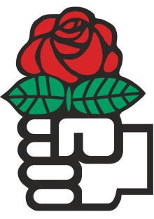
Fist and rose
The emblem was drawn in 1969 by the French graphic artist Marc Bonnet and became popular within the Socialist Party (PS), which made it its official logo in 1971.
[4][5] In late 1969, Calandra asked Yann Berriet, the founder of a communication agency, to come up with ideas expected to signal change and attract new members, especially women, with the request that they not look "too bolshevik".
A small signature by Bonnet was originally part of the design, along the leftmost petal of the flower, as the PS wished to display professionalism; it was later removed to facilitate the party's merchandising.
[12] There was a bottom-up element to its spread: since the Paris poster included, as legally required, the name and contact information of the printing house, some federations directly called it to obtain the picture.
Due to the new leadership's willingness to reinterpret party history and to distance itself from the post-war decades, it was more slowly accepted in areas with long-standing socialist support, for example in northern France.
[17] The emblem's diminishing or returning visibility subsequently tended to depend on the party's wish to modernize and tone down its heritage, or to state its left leanings again.
[19] In 2010, the party logo became a larger "PS", "limiting the rose in the fist to a marginal visual role, like a post-ideological afterthought",[20] positioned as in superscript.
This is historically due to the strength of the French Communist Party (PCF), which also used red, and by distinction with which the PS is commonly displayed with a paler hue on graphics, a custom which settled in the 1970s.
[23][24] The Socialist Party of Albania (PS or PSSh) uses the fist and rose, in José María Cruz Novillo’s Spanish version.
As often gleefully retold by Pannella, Giacomo Mancini, the secretary of the Italian Socialist Party (PSI) which was closer ideologically to the French PS and affiliated to the SI, was present as the same meeting and also wished to use the emblem, but lacked internal party support to remove the traditional symbols, which included the Marxist hammer and sickle.
[8] In 1980, the PR decided to add a sign of mourning to its logo to pay homage to the part of humanity which was victim of hunger and war, reflecting its new internationalist platform.
Although the TRP went with a different logo, the party, and other organizations in what has been referred to as the "radical galaxy", continued using the fist and rose emblem when running in elections, for example the Pannella List.
In 2005–2007, a short-lived alliance in the Italian left was called the Rose in the Fist (Rosa nel Pugno, RnP), and used Bonnet's emblem.
Following the dissolution of the second SDPR in 2007, Gorbachev founded a non-governmental organization, the Union of Social Democrats (SSD), which used the fist and rose.
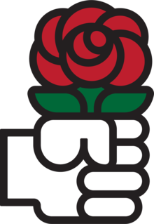
It uses a design redrawn by José María Cruz Novillo, on a commission by Guillermo Galeote, a member of the PSOE leadership, made at the time of the party's legalization during the transition to democracy.
[34] Cruz Novillo, inspired by the Dutch PvdA version, used cleaner, more geometric shapes than Bonnet and more horizontal and vertical lines, expressing "order and modernity".
[33] He inverted the picture, so that a left hand would hold the rose; he later explained that this signalled a difference with communists, who usually raise their right fist.
The emblem was associated with the party's accession to government under Felipe González, and remained in use during José Luis Rodríguez Zapatero’s time in office.
[40] In 2017, the American fashion group Urban Outfitters used the Spanish version of the logo on one of its t-shirts, sparking protest from Cruz Novillo's son.
The hands are in white and black lines respectively, and some branches color the skins beige and brown, a reference to race and ethnicity issues and to the civil rights movement.
Another derived logo displays the classic rose under three raised fists of different skin colors; it is used by the Palestine Solidarity Working Group.
The emblem was picked up by the Socialist International (SI) in 1979, in a variant inspired from José María Cruz Novillo's 1977 Spanish version, although restored to a right hand directed left,[35] and with the leaves coloured green.
[47] It may have been popularized at a joint rally of the PSOE and the Confederation of the Socialist Parties of the European Community (the present PES) in April 1977 in Madrid.
The Ours research group owns posters of May 68 featuring a hand holding a flower, and mentions that the imagery had been used by anarchists in Spain and southern France in the 1960s.
"[16] SPOE politician Alfonso Guerra, in his Dictionary of the Left, tones down the symbolism of the fist as "the strength […]—of labour, of workers", rather than as a reference to the revolution, and that of the rose to "the sensibility of culture, of thought, of beauty".
[33] The original design uses bold, black lines, making the emblem simple, but strong,[61] and reminds of the style of bande dessinée comics.
[8] In response to suggestions of plagiarism by Urban Outfitters and by the Albanian PSSh, the PSOE stated that it owned copyright on the Spanish version, although it was not clear if the designer José María Cruz Novillo also maintained rights over it.
When it gave it up, the Dutch PvdA switched to a new logo in which a small raised fist is drawn by the central petals of the rose.
For example, during the 2015 Spanish local elections, the PSOE temporarily changed its logo to the Cruz Novillo fist redrawn as a thumb signal, accompanying the slogan "I say yes".
[63] The fist and rose has sometimes been laid on an alternative graphic identification shared by left-wing parties in several countries, a plain red square with white text, for example in Spain (2001 to 2013; since 2023)[34][38][63] or in French-speaking Switzerland (since 2009).