Harvey Kurtzman's editorship of Mad
Featuring pop-culture parodies and social satire, what began as a color comic book became a black-and-white magazine with its 24th issue.
In 1952 EC Comics publisher William Gaines suggested Kurtzman take on a humor title to supplement his income as editor and writer on the war series Two-Fisted Tales and Frontline Combat.
Mad's signature style was to target pop-culture subjects with parody and social satire, and playfulness such as covers disguised as school notebooks or contents printed upside-down.
Kurtzman went from one financially unstable publication to another before landing a regular position at Hefner's Playboy magazine with the comic strip Little Annie Fanny.
[2] In late 1950 Kurtzman began writing and editing the adventure comic book Two-Fisted Tales for EC; the war title Frontline Combat followed in mid-1951.
[4] He spent days or weeks researching story details,[5] in the New York Public Library[4] or interviewing and corresponding with GIs.
[17] In the fourth issue appeared the Wally Wood-drawn "Superduperman", a parody of Superman and Captain Marvel, and the copyright infringement lawsuit that National Periodicals had recently brought against Fawcett Comics.
Other parodies in this style followed, targeting such poems as "The Face upon the Barroom Floor" (#10), "Paul Revere's Ride" (#20), "The Raven" (#9), and "The Wreck of the Hesperus" (#16).
[19] A parody of the comic strip Bringing Up Father in the seventeenth issue draws attention to societal tolerance of domestic violence.
[22] Gaines canceled Two-Fisted Tales and Frontline Combat in 1954 so Kurtzman could dedicate himself the more profitable Mad,[23] which became EC's first monthly title with issue #10 (April 1954).
A Mickey Spillane parody "My Gun Is the Jury" led to the arrest of EC business manager Lyle Stewart for selling its issue to undercover police.
The American Civil Liberties Union watched closely from the sidelines as an EC lawyer succeeded in having the case dismissed.
[31][page needed] The Senate Subcommittee on Juvenile Delinquency brought pressure on such comic books in 1954, and EC, one of the major purveyors of such fare, found their distributor refusing their wares.
He also chose to forego color and to have typeset lettering instead of the hand-lettering typical of comic books to give the magazine a sheen of class.
[34] The magazine-format twenty-fourth issue of Mad débuted in July 1955[33] with a 25-cent cover price, and the EC crew went to watch it coming off the presses.
[16] It included meticulously rendered advertisement parodies and text pieces by humorists such as Ernie Kovacs, Stan Freberg, and Steve Allen.
This allowed the material to be recycled, and Ballantine Books published the Kurtzman-edited Mad Reader[39] that November[40] with an introduction by comedian Roger Price.
"[36] The image was an enlargement of a postcard Kurtzman had found,[45] and his name changed from issue to issue—Melvin Coznowski in one, Mel Haney in another—even the "What—Me Worry?"
[48] Kurtzman's own art contributions diminished under the increased editorial workload; he did create the border artwork that adorned several years' worth of the magazine's covers, as well as the logo that still is used.
[31] From another angle Gaines and Feldstein launched the Adult Picto-Fiction line of comics magazines in a Mad-like black-and-white, typeset format; each title was canceled after only two issues.
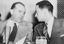
[59] Feldstein was still fresh on the job when Time reported that Hefner was to publish a "still unnamed magazine" and had "hired the whole staff of Mad, a short-lived satirical pulp."
This reluctance was the target of a parody of the magazine in Esquire, prefaced with: "Just imagine what it would be like if you picked up your monthly copy of Bad and found us dealing with subjects of genuine significance in America!
As Kurtzman described it, "Satire and parody work best when what you're talking about is accurately targeted ... when you reveal a fundamental flaw or untruth in your subject.
"[12] The parodies struck at the basic premises of their targets: the hero in "Superduperman" proves his mettle by defeating his foe and assumes he can win the heart of the woman he desires with displays of his machismo.
They imitated Life magazine,[77] a tabloid newspaper,[78] a racetrack results sheet,[79] and a school composition book, with the notice: "Designed to sneak into class".
[80] On the 21st cover was a parody of the mail-order Johnson Smith Company's ads that were common in comic books—the Mad version offered a wide range of ridiculous merchandise, including torpedoes and live alligators.
He wrote in a colloquial style replete with wordplay, including a plethora of Yiddish, foreign, or made-up words used in a nonsensical manner: "furshlugginer", "potrzebie", and "veeblefetzer" among them.
While following Kurtzman's layouts strictly, Elder greatly expanded the art, inserting countless visual gags into the backgrounds.
[85] #19 imitated a horse-racing form, and #21 was done in the manner of densely-packed advertisements for mail-order novelty products that often appeared in comic books.
[86] Mad's success immediately led to a slew of imitators form other publishers: Bughouse, Flip, Madhouse, Riot, Whack, Wild, and others.