Icon (computing)
The icon itself is a quickly comprehensible symbol of a software tool, function, or a data file, accessible on the system and is more like a traffic sign than a detailed illustration of the actual entity it represents.
[2] In activating an icon, the user can move directly into and out of the identified function without knowing anything further about the location or requirements of the file or code.
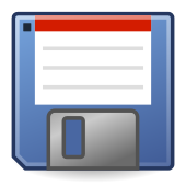
This category includes stylized drawings of objects from the office environment or from other professional areas such as printers, scissors, file cabinets and folders.
This category includes stylized drawings used to refer to actions "printer" and "print", "scissors" and "cut" or "magnifying glass" and "search".
Metonymy is in itself a subset of metaphors that use one entity to point to another related to it such as using a fluorescent bulb instead of a filament one to represent power saving settings.
These commercial icons serve as functional links on the system to the program or data files created by a specific software provider.
The detailing of the icon image needs to be simple, remaining recognizable in varying graphical resolutions and screen sizes.
Computer icons are by definition language-independent but often not culturally independent; they do not rely on letters or words to convey their meaning.
These visual parameters place rigid limits on the design of icons, frequently requiring the skills of a graphic artist in their development.
[2] A series of recurring computer icons are taken from the broader field of standardized symbols used across a wide range of electrical equipment.
These warning icons, first designed to regulate automobile traffic in the early 1900s, have become standardized and widely understood by users without the necessity of further verbal explanations.
In designing software operating systems, different companies have incorporated and defined these standard symbols as part of their graphical user interface.
The signified can have multiple natures: virtual objects such as files and applications, actions within a system or an application (e.g. snap a picture, delete, rewind, connect/disconnect etc...), action in the physical world (e.g. print, eject DVD, change volume or brightness etc...) as well as physical objects (e.g. monitor, compact disk, mouse, printer etc...).
A subgroup of the more visually rich icons is based on objects lifted from a 1970 physical office space and desktop environment.
This model originally enabled users, familiar with common office practices and functions, to intuitively navigate the computer desktop and system.
The icons stand for objects or functions accessible on the system and enable the user to do tasks common to an office space.
[7] Dr. David Canfield Smith associated the term "icon" with computing in his landmark 1975 PhD thesis "Pygmalion: A Creative Programming Environment".
[8][9] In his work, Dr. Smith envisioned a scenario in which "visual entities", called icons, could execute lines of programming code, and save the operation for later re-execution.
[10] Dr. Smith later served as one of the principal designers of the Xerox Star, which became the first commercially available personal computing system based on the desktop metaphor when it was released in 1981.
In closed systems such as iOS and Android, the use of icons is to a degree regulated or guided [13] to create a sense of consistency in the UI.
The computer monitor continues to display primary icons on the main page or desktop, allowing easy and quick access to the most commonly used functions for a user.
[7][14] Spatial management techniques play a bigger role in mobile devices with their much smaller screen real estate.
In order to maintain consistency in the look of a device, OS manufacturers offer detailed guidelines for the development and use of icons on their systems.
With the increasing ability to customize the desktop, it is important for the icon itself to display in a standard color which cannot be modified, retaining its characteristic appearance for immediate recognition by the user.
The standard icon is generally the size of an adult thumb, enabling both easy visual recognition and use in a touchscreen device.
Larger icons serve also as part of the accessibility features for the visually impaired on many computer systems.
Icons can also be augmented with iconographic motion - geometric manipulations applied to a graphical element over time, for example, a scale, rotation, or other deformation.
Research has shown iconographic motion can act as a powerful and reliable visual cue, a critical property for icons to embody.
The smiley, and by extension other emoticons, are used in computer text to convey information in a non-verbal binary shorthand, frequently involving the emotional context of the message.
However, if one is creating an application in the Windows API he or she can simply add a line to the program's resource script before compilation.