Kelmscott Press
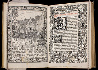
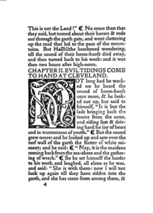
[2] Kelmscott Press books sought to replicate the style of 15th-century printing and were part of the Gothic revival movement.
Morris was interested in medieval book design, visiting the Bodleian Library often with Burne-Jones to examine illuminated manuscripts.
The Press closed shortly after Morris's death, but has exerted a huge influence on book production throughout the world.
Morris carefully studied the techniques of the illuminators and the woodblock carvers in hopes of reviving that type of craftsmanship.
Walker told Morris where to buy high-quality tools and materials for printing, as well as where to hire skilled printers.
[17] While Morris did not pay himself any sort of salary, he usually broke even or made a little bit of money from the sales of Kelmscott Press books.
[24] Morris believed that the indentations were an important part of the book's design, telling customers that The Gold Legend should not be pressed, which would have made the pages artificially smooth.
After finding out that most buyers did not rebind the books, Morris started trimming the deckle-edged edges after publishing Biblia innocentium.
[27] The softer ink did not dry very quickly, and Morris told customers that the book would not be ready for traditional binding until a year after its printing.
Morris adopted the practice of smaller spaces between words and between lines, although it affected the legibility of the Kelmscott books.
[34] Peterson notes that even though Morris and the Kelmscott Press was focused on returning to 15th-century designs, they still used the modern Victorian technology of photography in its art.
Morris's own typefounders, Sir Charles Reed and Sons, started selling a Kelmscott Old Style type.
While medieval texts had delicate illuminations covering their margins, the wood engravings Morris made in imitation of them were very heavy, and created production problems in the Chaucer, requiring the hand press to be reinforced with steel because of the weight of the large ornaments.
[46] At times Morris preferred that his wood engravers replicated his designs exactly, even though this was at odds with John Ruskin's theory that craftsmen should have influence in the final aesthetic product they help produce.
[48] Burne-Jones, a frequent illustrator of Kelmscott books, based many of his drawings for the wood engravings on his own previous paintings.
The Kelmscott mark with a large rectangle and leafy background was first published in The History of Godefrey of Bolyne and was used mostly for quartos.
[31] Kelmscott printed an American edition of Hand and Soul by Dante Rossetti in 1895 which was distributed by Way and Williams Publishers.
[53] The press published editions of works by Keats, Shelley, Ruskin, and Swinburne, as well as copies of various medieval texts.
When Talbot read "Natalia's Resurrection", she insisted that the poems not be printed, and the 18 pages of poetry that were already set in type were removed from publication.
[57] Andy Orchard, professor of Anglo-Saxon at the University of Oxford,[59] noted that Morris's translation was very faithful to the original syntax and words, especially with the compounds he created like "shade-goer" and "horn-house".
In so doing, Morris avoided romance words and wrote in an elaborate medieval style that appears to the modern reader as "most obnoxious".
[74] Critical response to the Kelmscott Chaucer was effulgent, with reviewers in 1896 calling it "the finest book ever printed" and the press's "crowning achievement".
[78] According to Alan Crawford, a historian of the Arts and Crafts movement,[79] it was "like the Holy Grail tapestries: an intimate collaboration between Morris and Burne-Jones, their masterpiece in that particular medium, and their tribute to an early master of their imagination".
Peter Faulkner, a William Morris expert,[80] expressed his preference for The Canterbury Tales by the Golden Cockerel Press, noting that in the Kelmscott Chaucer "the two sixty-three-line columns of 12-point type on the large page do not make for easy reading".
Morris's work aligns with the "idealist" aesthetic, which centers around the way the task of art uplifts humanity to approach an ideal.
Miller argues that Morris was working toward an ideal of production that made print a utopian space for post-revolutionary art.
[88] The story of News from Nowhere described a utopia called "Nowhere", where communal discussion occurred in verbal discourse, textual communication being the language of bureaucracy.
[92] Jeffrey Skoblow argued that the "rigorously materialist impulse" in the Kelmscott books was part of "a great Romantic-Marxist continuum" that explored commodification.
William S. Peterson, an English professor at the University of Maryland and a Morris scholar,[96] called Ashbee's typefaces "ugly and eccentric" but stated that the books themselves "have a certain period charm".
[98] Pamela Todd, an art historian,[99] describes their books as "beautiful" and achieve "the same powerful effect as Morris".