Leading
In typography, leading (/ˈlɛdɪŋ/ LED-ing) is the space between adjacent lines of type; the exact definition varies.
In The Elements of Typographic Style, Robert Bringhurst recommends more leading for longer measures, and for typefaces with darker weight, larger x-height, a vertical axis, or no serifs.
[3] Double spacing is an entrenched practice due to the era of typewriters and, in academic settings, to allow the addition of handwritten comments and proofreading.
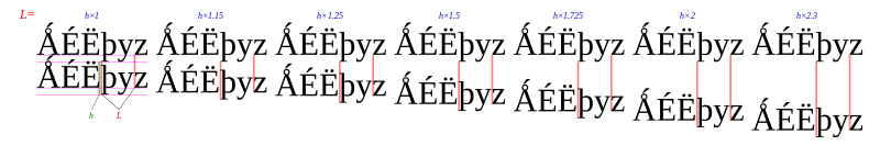
[5] Too much leading can cause continuity problems, as the eyes of the reader are required to travel a greater distance between lines of text.
[6] Text set "solid" (no leading) appears cramped, with ascenders almost touching descenders from the previous line.
Letters with high ascenders and low descenders can interfere with one another between lines, if the leading is small enough to allow them to touch one another.
[2] This block of text has default leading: Typography (Greek: typos "form", graphein "to write") is the art and technique of setting written subject matter in type using a combination of typeface styles, point sizes, line lengths, line leading, character spacing, and word spacing to produce typeset artwork in physical or digital form.The same block of text set with 50% leading: Typography (Greek: typos "form", graphein "to write") is the art and technique of setting written subject matter in type using a combination of typeface styles, point sizes, line lengths, line leading, character spacing, and word spacing to produce typeset artwork in physical or digital form.The same block of text at 100% leading: Typography (Greek: typos "form", graphein "to write") is the art and technique of setting written subject matter in type using a combination of typeface styles, point sizes, line lengths, line leading, character spacing, and word spacing to produce typeset artwork in physical or digital form.In CSS, leading refers to the difference between the content height and the value of the line-height property.
User agents center glyphs vertically in an inline box, which adds half-leading on the top and bottom.
[7] The leading may be increased to align the bottom line of text on a page in a process known as feathering,[8] carding, or vertical justification.