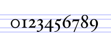
Text figures
Other schemes exist; for example, the types cut by the Didot family of punchcutters and typographers in France between the late 18th and early 19th centuries typically had an ascending 3 and 5, a form preserved in some later French typefaces.
Although many conventional typefaces have both types of numerals in full, early digital fonts only had one or the other (with the exception of those used by professional printers).
They were introduced to European typography in 1788, when Richard Austin cut a new font for typefounder and publisher John Bell, which included three-quarter height lining figures.
They were further developed by 19th-century type designers, and largely displaced text figures in some contexts, such as newspaper and advertising typography.
[12] During the period of transition from text figures to lining, a justification for the old system was that the height differences helped distinguish similar numbers, while a justification for lining figures was that they were clearer (being larger) and that they looked better by giving all page numbers the same height.