Looker Studio
Google Data Studio's offering was a simple, low-cost, and easy way to connect data sources and create dashboards,[11] while Looker offered a more enterprise-focused solution with robust support for transformations and permissions.
[13] This name change was also accompanied by more updates including key security and management services, integration with Google Sheets, and more visualization tools.
[13] Google also launched a new tier offering, Looker Studio Pro, with enhanced features for enterprise team collaboration and management.
For example, users can edit the layout, color options, font, and canvas size of a dashboard so that it showcases their data more effectively, and corresponds with the company's branding.
[19] This means that everyone will have access to change dynamic control features such as date ranges or sorting options without the report setup needing to be updated.
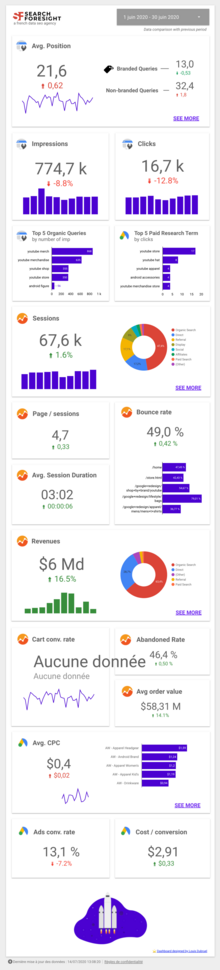
[18] When deciding how to visualize data, users can choose from 36 different chart types and variations.
[20] After choosing the visualization method, individuals will then define dimensions and metrics for the chart or table to generate.
[20] When reporting on core objectives or high-level numbers, scorecard charts can display data in an attention-catching way.
This type of chart monitors the performance of a single metric against a target, showing the progress similar to that of a car dashboard display.
[20] Line charts help show trends in data and compare metrics along an ordinal axis.
[20] Users can add multiple metrics to the chart to show their values over time displayed as lines, bars, or a combination of the two.
[20] Users can also add 3 types of trendlines to a time series chart in Looker Studio.
[20] Trendlines, however, can be added within Looker Studio to indicate the type of relationship these data points have including linear, exponential, or polynomial.
[20] Treemap charts are also offered within Looker Studio to display data in hierarchies based on defined dimensions.