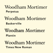
Plantin (typeface)
It was created in 1913 by the British Monotype Corporation for their hot metal typesetting system and is named after the sixteenth-century printer Christophe Plantin.
[1] It is loosely based on a Gros Cicero roman type cut in the 16th century by Robert Granjon held in the collection of the Plantin–Moretus Museum, Antwerp.
[3] Monotype engineering manager Frank Hinman Pierpont visited the Plantin-Moretus Museum, where he acquired a printed specimen of historic types.
[1] James Moran and John Dreyfus suggested that an inspiration for the design may have been a c. 1910 family from the Shanks foundry known as "Plantin Old Style", advertised as highly legible.
[9][3][4][10]) Plantin was designed and engraved into metal at the Monotype factory in Salfords, Surrey, which was led by Pierpont and draughtsman Fritz Stelzer.
[1] However, other revivals of Aldine/French renaissance typefaces followed from several hot metal typesetting companies in the following decades, including Monotype's own Poliphilus, Bembo and Garamond, Linotype's Granjon and Estienne and others, becoming very popular in book printing for body text.
[16][17][18][19] As the basic font is relatively dark on the page, Monotype offered a 'light' version as well as a bold, which Hugh Williamson describes as "particularly suitable for bookwork.
[27][28] Times is similar to Plantin but "sharpened" or "modernised", with increased contrast (particularly resembling designs from the eighteenth and nineteenth century) and greater "sparkle".
[33][34] Sowersby followed it with a newspaper typeface, Tiempos, influenced by Times New Roman[35][36] and later, in mid-2023, released a digital revival of the metal Plantin 110 cut itself—rather than a reinterpretation—called Martina Plantijn.