Reverse-contrast typefaces
A reverse-contrast or reverse-stress letterform is a typeface or custom lettering where the stress is reversed from the norm, meaning that the horizontal lines are the thickest.
This is the reverse of the vertical lines being the same width or thicker than horizontals, which is normal in Latin-alphabet writing and especially printing.
Early 'roman' or 'antiqua' type followed this model, often placing the thinnest point of letters at an angle and downstrokes heavier than upstrokes, mimicking the writing of a right-handed writer holding a quill pen.
[5][10][28][29][30] A caps-only design, the foundry's steel master punches survive in the collection of the St Bride Library, London.
To make the effect even more shocking, the triangular serifs were inverted (becoming thinner as they met the letter, not thicker), and the thicker line on the "A" was moved from its normal position on the right (the natural position matching the handwriting of a right-handed writer) to the left, making a letter that seems to have been drawn the wrong way round.
Writing for Print magazine, Paul Shaw described it as "one of the most bizarre slab serif types of the 19th century.
[8][9] Reverse-contrast designs do slightly resemble capitalis rustica writing from Ancient Rome, which also has emphatic horizontal serifs at top and bottom, although this may be a coincidence.
[37] Within a few years of their introduction the eminent printer Thomas Curson Hansard had lamented them as "typographic monstrosities": Fashion and Fancy commonly frolic from one extreme to another.
[38]In contrast, Walter Tracy described the design in 1986 as "a jeu d'esprit, not meant to be judged in conventional aesthetic terms.
Peter Biľak's Karloff is a family of normal and matching reverse-contrast fonts with upper- and lower-case, together with a low-contrast slab serif design, all with the same basic structure.
Biľak and his colleagues tried to strictly invert the contrast of a conventional Didone font and interpolate the two for the low-contrast slab serif.
[49][50][31] Paul Barnes of Commercial Type has released an Italian revival, along with extensive information on the research made for the project and a companion French Antique design (see below).
[51][8][9] Village Type's Arbor also a lower-case, while Match & Kerosene's Slab Sheriff is caps-only, with a "A" featuring the conventional stress on the right.
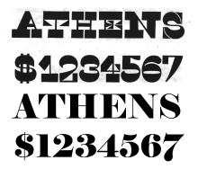
They are often associated with "wild-west" printing and seen on circus posters and wanted notices in western movies, although the style was really used in many parts of the world during this period.
[36] Although Bodoni and Didot fuelled their designs with the calligraphic practices of their time, they created new forms that collided with typographic tradition and unleashed a strange new world, where the structural attributes of the letter-serif and stem, thick and thin strokes, vertical and horizontal stress-would be subject to bizarre experiments ... Fonts of astonishing height, width and depth appeared: expanded, contracted, shadowed, inlined, fattened, faceted and floriated.
Serifs abandoned their role as finishing details to become independent architectural structures, and the vertical stress of traditional letters canted in new directions.
[59][60] Their collection shows the many other names used for wood type which display reverse-contrast characteristics, including "Celtic", "Belgian", "Aldine" and "Teutonic", as well as Italian again and sometimes "Tuscan" or "Etruscan" also.
[61] A variety of more modern adaptations have been made of the style, including Robert Harling's Playbill (1938) and more recently Adrian Frutiger's Westside, URW++'s Zirkus and Bitstream's P. T.
I found the existing Italiennes with their big feet too harsh and strict ... the fine curves in the serifs give Westside its own expression.
[65] A well-reviewed modernisation of the style has been Trilby[66] by David Jonathan Ross, who has written and lectured on the history of the genre.