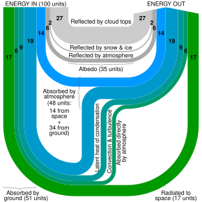
Sankey diagram
[4] One of the most famous Sankey diagrams is Charles Minard's Map of Napoleon's Russian Campaign of 1812.
Minard had used this form of diagram for visualising flow of goods and transport of people from at least since 1844.
[8] Eurostat, the Statistical Office of the European Union, has developed an interactive Sankey web tool to visualise energy data by means of flow diagrams.
[9] The tool allows the building and customisation of diagrams by playing with different options (country, year, fuel, level of detail).
[10] Users can select specific countries, points of time back to 1973, and modify the arrangement of various flows within the Sankey diagram.


