Thesis (typeface)
Thesis is a large typeface family designed by Luc(as) de Groot.
Originally released by FontFont in 1994, it has been sold by de Groot through his imprint LucasFonts since 2000.
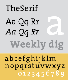
A distinctive figure is the 'Q' with the detached tail, somewhat similar to that on Dwiggins' Metro; an alternate is provided for when this is unsuitable.
In TheSans Condensed, each weight only includes roman and italic, but all 4 number styles can be found.
Lucas designed the Bold version of the type, while Pascal finalized the Bold design by modifying some glyphs, spacing and encoding/scripting the font, and later developed TheMix Arabic Regular.
The font was included in the Typographic Matchmaking Project organized by the Khatt Foundation.
Expert fonts include arrows, swashes, fraction figures, alternate styles, mathematic symbols, ornaments.
de Groot's choice of weights to release was developed using an "interpolation theory".
[8] As an amusement, de Groot also developed a number of parodic reworkings of Thesis, including Nebulae and JesusLovesYouAll.