Tube map
[5] In 2006, the Tube map was voted one of Britain's top 10 design icons which included Concorde, Mini, Supermarine Spitfire, K2 telephone box, World Wide Web and the AEC Routemaster bus.
His colleagues pointed out the similarities, however, and he once produced a joke map with the stations replaced by electrical circuit symbols and names, with terminology such as "Bakerlite" for the Bakerloo line.
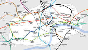
[12] To that end, Beck devised a simplified map with stations, straight-line segments connecting them, and the River Thames; and lines running only vertically, horizontally, or on 45° diagonals.
London Underground was initially sceptical of his proposal since it was an uncommissioned spare-time project and was tentatively introduced to the public in a small pamphlet in 1933.
[13] After its initial success, he continued to design the Tube map until 1960, a single (and unpopular) 1939 edition by Hans Scheger being the only exception.
By 1960, Beck had fallen out with the Underground's publicity officer, Harold Hutchison, who was not a designer himself but drafted his own version of the Tube map that year.
It removed the smoothed corners of Beck's design and created some highly cramped areas (most notably around Liverpool Street station), and the lines were generally less straight.
More recent designs have incorporated changes to the network, such as the Docklands Light Railway and the extension to the Jubilee line.
One of the major changes to be made to the revision of the Tube map put out in September 2009 was the removal of the River Thames.
[21] Since 2004, Art on the Underground has commissioned various British and international artists to create a cover for the pocket map.
[22] These free maps are one of the largest public art commissions in the UK, with millions of copies printed.
[23] Over 35 different designs have been produced, from artists such as Rachel Whiteread, Yayoi Kusama, Tracey Emin and Daniel Buren.
Improvements in colour printing technology have reduced that problem and the map has coped with the identification of new lines without great difficulty.
The following shapes have been used: Since 1970 the map has used a reversed (red on white) British Rail "double arrow" beside the station name to indicate main line interchanges.
Contemporary maps have marked stations offering step-free access with a blue circle containing a wheelchair symbol in white.
The maps showing all the National Rail routes provide useful additional information at the expense of considerably increased complexity, as they contain almost 700 stations.
[40][41] While London Underground have been protective of their copyright they have also allowed their concepts to be shared with other transport operators (Amsterdam's GVB even pays tribute on its map).
It follows Beck's styling cues, and in size, design and layout, it is nearly a clone of the London map of the late 1930s, right down to the use of the Underground roundel.
In June 2011, the British designer Mark Noad unveiled his vision for a more 'geographically accurate' London Underground map.
[50] The map is an attempt to see if it is possible to create a geographically accurate representation of the Underground system and still retain some of the clarity of Beck's original diagram.
His design, based on a series of concentric circles, emphasised the concept of the newly completed orbital loop surrounding Central London with radial lines.
[52] A map created to illustrate Tube-related articles on Wikipedia in 2014 was praised for its clarity and for including future developments such as Crossrail.
[53][54] In July 2015, a map of the network displaying walking calorie burn information for each leg was published by Metro newspaper.
[60] That has been officially sanctioned only on a few occasions: Stylistic aspects of the London diagram, such as the line colours and styles and the station ticks or interchange symbols, are also frequently used in advertising.