Typeface anatomy
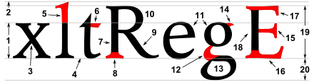
For the rational mind, type design can be a maddening game of drawing things differently in order to make them appear the same.The strokes are the components of a letterform.
Typographers also speak of an instroke, where one starts writing the letter, as at the top of a c f, and an outstroke, where the pen leaves off, as at the bottom of c e j k t y.
A seriffed terminal may be described as a wedge, bulbous, teardrop, slab, etc., depending on the design of the type.
A subtle change in proportion impacts weight, perception, measure, and legibility.
The letterform height compared to its stroke width modifies the aspect ratio; a slight change in weight sometimes helps to create emphasis.
The disparity between thick and thin strokes, known as stress, alters optical perception.
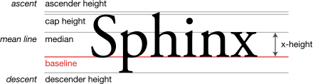
[4] During the late metal type period, many fonts (particularly in American typefounding) were issued to "common line".
[12] This meant that they were made to standardised proportions, so that fonts of different typefaces could be mixed with no difficulty.
This made it possible to mix typefaces from completely different genres such as sans-serifs and serifs and have the cap height, baseline and linespacing match perfectly, something not possible with most digital fonts.
Titling capitals, meanwhile, were issued taking up the whole space of the metal type area, with no room for descenders.