Contour line
In the latter case, the method of interpolation affects the reliability of individual isolines and their portrayal of slope, pits and peaks.
The oldest known isobath (contour line of constant depth) is found on a map dated 1584 of the river Spaarne, near Haarlem, by Dutchman Pieter Bruinsz.
In 1801, the chief of the French Corps of Engineers, Haxo, used contour lines at the larger scale of 1:500 on a plan of his projects for Rocca d'Anfo, now in northern Italy, under Napoleon.
[9][10][11] By around 1843, when the Ordnance Survey started to regularly record contour lines in Great Britain and Ireland, they were already in general use in European countries.
[9][12][13] As different uses of the technique were invented independently, cartographers began to recognize a common theme, and debated what to call these "lines of equal value" generally.
During the early 20th century, isopleth (πλῆθος, plethos, 'amount') was being used by 1911 in the United States, while isarithm (ἀριθμός, arithmos, 'number') had become common in Europe.
Additional alternatives, including the Greek-English hybrid isoline and isometric line (μέτρον, metron, 'measure'), also emerged.
Perhaps the latest to develop are air quality and noise pollution contour maps, which first appeared in the United States in approximately 1970, largely as a result of national legislation requiring spatial delineation of these parameters.
The prefix "'iso-" can be replaced with "isallo-" to specify a contour line connecting points where a variable changes at the same rate during a given time period.
An isogon (from Ancient Greek γωνία (gonia) 'angle') is a contour line for a variable which measures direction.
Instead, lines are drawn to best approximate the locations of exact values, based on the scattered information points available.
More accurately, isobars are lines drawn on a map joining places of equal average atmospheric pressure reduced to sea level for a specified period of time.
[21] The distribution of isobars is closely related to the magnitude and direction of the wind field, and can be used to predict future weather patterns.
Isallobars are lines joining points of equal pressure change during a specific time interval.
[24] In general, weather systems move along an axis joining high and low isallobaric centers.
An isotherm (from Ancient Greek θέρμη (thermē) 'heat') is a line that connects points on a map that have the same temperature.
[27][28] According to Thomas Hankins, the Scottish engineer William Playfair's graphical developments greatly influenced Alexander von Humbolt's invention of the isotherm.
[29] Humbolt later used his visualizations and analyses to contradict theories by Kant and other Enlightenment thinkers that non-Europeans were inferior due to their climate.
An isotach (from Ancient Greek ταχύς (tachus) 'fast') is a line joining points with constant wind speed.
"Contour line" is the most common usage in cartography, but isobath for underwater depths on bathymetric maps and isohypse for elevations are also used.
Conversely, for an island which consists of a plateau surrounded by steep cliffs, it is possible to use smaller intervals as the height increases.
Whether crossing an equipotential line represents ascending or descending the potential is inferred from the labels on the charges.
The general mathematical term level set is often used to describe the full collection of points having a particular potential, especially in higher dimensional space.
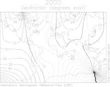
An isodynamic line (from δύναμις or dynamis meaning 'power') connects points with the same intensity of magnetic force.
Some of the most widespread applications of environmental science contour maps involve mapping of environmental noise (where lines of equal sound pressure level are denoted isobels[34]), air pollution, soil contamination, thermal pollution and groundwater contamination.
Indifference curves (as shown at left) are used to show bundles of goods to which a person would assign equal utility.
In political science an analogous method is used in understanding coalitions (for example the diagram in Laver and Shepsle's work[36]).
This choice is made based upon the least intrusive form of contours that enable the reader to decipher the background information in the map itself.
Dotted or dashed lines are often used when the underlying base map conveys very important (or difficult to read) information.
In each of those cases it may be important to analyze (air pollutant concentrations or sound levels) at varying heights so as to determine the air quality or noise health effects on people at different elevations, for example, living on different floor levels of an urban apartment.