Italic type
The name comes from the fact that calligraphy-inspired typefaces were first designed in Italy, to replace documents traditionally written in a handwriting style called chancery hand.
Aldus Manutius and Ludovico Arrighi (both between the 15th and 16th centuries) were the main type designers involved in this process at the time.
[8] Manutius intended his italic type to be used not for emphasis but for the text of small, easily carried editions of popular books (often poetry), replicating the style of handwritten manuscripts of the period.
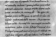
[11] In 1501, Aldus wrote to his friend Scipio: We have printed, and are now publishing, the Satires of Juvenal and Persius in a very small format, so that they may more conveniently be held in the hand and learned by heart (not to speak of being read) by everyone.Manutius' italic was different in some ways from modern italics, being conceived for the specific use of replicating the layout of contemporary calligraphers like Pomponio Leto and Bartolomeo Sanvito.
The Venetian Senate gave Aldus exclusive right to its use, a patent confirmed by three successive Popes, but it was widely counterfeited as early as 1502.
[14] Griffo, who had left Venice in a business dispute, cut a version for printer Girolamo "Gershom" Soncino, and other copies appeared in Italy and in Lyons.
[8][12] Some printers of Northern Europe used home-made supplements to add characters not used in Italian, or mated it to alternative capitals, including Gothic ones.
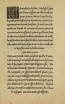
"[8][16][17] Chancery italics were introduced around 1524 by Arrighi, a calligrapher and author of a calligraphy textbook who began a career as a printer in Rome, and also by Giovanni Antonio Tagliente of Venice, with imitations rapidly appearing in France by 1528.
[8][24] Particularly influential in the switch to sloped capitals as a general practice was Robert Granjon, a prolific and extremely precise French punchcutter particularly renowned for his skill in cutting italics.
[55] The printing historian and artistic director Stanley Morison was for a time in the inter-war period interested in the oblique type style, which he felt stood out in text less than a true italic and should supersede it.
"[51][c] A few other type designers replicated his approach for a time: Van Krimpen's Romulus and William Addison Dwiggins' Electra were both released with obliques.
[d] Morison's Times New Roman typeface has a very traditional true italic in the style of the late eighteenth century, which he later wryly commented owed "more to Didot than dogma".
[61] Some serif designs primarily intended for headings rather than body text are not provided with an italic, Engravers and some releases of Cooper Black and Baskerville Old Style being common examples of this.
[65] In the 1950s, Gholamhossein Mosahab invented the Iranic font style, a back-slanted italic form to go with the right-to-left direction of the script.
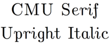
Font families with an upright or near-upright italic only include Jan van Krimpen's Romanée, Eric Gill's Joanna, Martin Majoor's FF Seria and Frederic Goudy's Deepdene.
[68] The Chicago Manual of Style suggests that parentheses and brackets surrounding text that begins and ends in italic or oblique type should also be italicised (as in this example), to avoid problems such as overlapping and unequally spaced characters.
An exception to this rule applies when only one end of the parenthetical is italicised (in which case roman type is preferred, as on the right of this example).
In The Elements of Typographic Style, however, it is argued that, since Italic delimiters are not historically correct, the upright versions should always be used, while paying close attention to kerning.
In Unicode, the Mathematical Alphanumeric Symbols block includes Latin and Greek letters in italics and boldface.