Misleading graph
One of the first authors to write about misleading graphs was Darrell Huff, publisher of the 1954 book How to Lie with Statistics.
The field of data visualization describes ways to present information that avoids creating misleading graphs.
[5] The use of biased or loaded words in the graph's title, axis labels, or caption may inappropriately prime the reader.
This can be both the result of intentionally attempting to mislead the reader or due to the phenomenon of illusory correlation.
[10] In a 3D pie chart, the slices that are closer to the reader appear to be larger than those in the back due to the angle at which they're presented.
Edward Tufte, a prominent American statistician, noted why tables may be preferred to pie charts in The Visual Display of Quantitative Information:[5] Tables are preferable to graphics for many small data sets.
Using pictograms in bar graphs should not be scaled uniformly, as this creates a perceptually misleading comparison.
[14] In the improperly scaled pictogram bar graph, the image for B is actually 9 times as large as A.
Or it can make small values appear to be negative due to how logarithmic scales represent numbers smaller than the base.
It has been stated, although mainly in a humorous way, that "anything looks linear on a log-log plot with thick marker pen" .
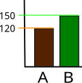
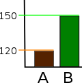
Commercial software such as MS Excel will tend to truncate graphs by default if the values are all within a narrow range, as in this example.
Several studies found that even if people were correctly informed that the y-axis was truncated, they still overestimated the actual differences, often substantially.
Additionally, the lack of tick marks prevents the reader from determining whether the graph bars are properly scaled.
In the scatter plot with missing categories on the left, the growth appears to be more linear with less variation.
In financial reports, negative returns or data that do not correlate with a positive outlook may be excluded to create a more favorable visual impression.
[citation needed] The use of a superfluous third dimension, which does not contain information, is strongly discouraged, as it may confuse the reader.
GDI is calculated as a percentage ranging from −100% to positive infinity, with zero percent indicating that the graph has been properly constructed and anything outside the ±5% margin is considered to be distorted.
[27] Several published studies have looked at the usage of graphs in corporate reports for different corporations in different countries and have found frequent usage of improper design, selectivity, and measurement distortion within these reports.
[27][28][29][30][31][32][33] The presence of misleading graphs in annual reports has led to requests for standards to be set.