Font
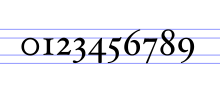
For instance, the typeface Bauer Bodoni (shown in the figure) includes fonts "Roman" (or "regular"), "bold" and "italic"; each of these exists in a variety of sizes.
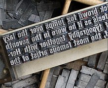
In a manual printing (letterpress) house the word "font" would refer to a complete set of metal type that would be used to typeset an entire page.
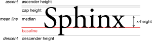
In addition to the character height, when using the mechanical sense of the term, there are several characteristics which may distinguish fonts, though they would also depend on the script(s) that the typeface supports.
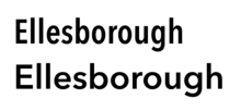
Different fonts of the same typeface may be used in the same work for various degrees of readability and emphasis, or in a specific design to make it be of more visual interest.
The TrueType font format introduced a scale from 100 through 900, which is also used in CSS and OpenType, where 400 is regular (roman or plain).
As a result, many older multi-weight families such as Gill Sans and Monotype Grotesque have considerable differences in weights from light to extra-bold.
Since the 1980s, it has become common to use automation to construct a range of weights as points along a trend, multiple master or other parameterized font design.
In many sans-serif and some serif typefaces, especially in those with strokes of even thickness, the characters of the italic fonts are only slanted, which is often done algorithmically, without otherwise changing their appearance.
The gothic style of the roman script with broken letter forms, on the other hand, is usually considered a mere typographic variant.
Cursive-only scripts such as Arabic also have different styles, in this case for example Naskh and Kufic, although these often depend on application, area or era.
[citation needed] These include the look of digits (text figures) and the minuscules, which may be smaller versions of the capital letters (small caps) although the script has developed characteristic shapes for them.
Some typefaces include fonts that vary the width of the characters (stretch), although this feature is usually rarer than weight or slope.
Compressing a font design to a condensed weight is a complex task, requiring the strokes to be slimmed down proportionally and often making the capitals straight-sided.
These separate fonts have to be distinguished from techniques that alter the letter-spacing to achieve narrower or smaller words, especially for justified text alignment.
Most typefaces either have proportional or monospaced (for example, those resembling typewriter output) letter widths, if the script provides the possibility.
[13][14][15] For instance, thinner stroke weight might be used if a font style is intended for large-size display use, or ink traps might be added to the design if it is to be printed at small size on poor-quality paper.
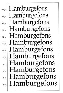
[16] This was a natural feature in the metal type period for most typefaces, since each size would be cut separately and made to its own slightly different design.
For instance, the smaller optical size of Helvetica Now is labelled "Micro",[32] while the display variant of Hoefler Text is called "Titling".
Many digital (and some metal type) fonts are able to be kerned so that characters can be fitted more closely; the pair "Wa" is a common example of this.
Some fonts, especially those intended for professional use, are duplexed: made with multiple weights having the same character width so that (for example) changing from regular to bold or italic does not affect word wrap.
To avoid paying licensing fees for this set, many computer companies commissioned "metrically compatible" knock-off fonts with the same spacing, which could be used to display the same document without it seeming clearly different.
Arial and Century Gothic are notable examples of this, being functional equivalents to the PostScript standard fonts Helvetica and ITC Avant Garde respectively.
The practice is not new: in the 1930s, Gill Sans, a British design, was sold abroad with alternative characters to make it resemble typefaces such as Futura popular in other countries, while Bembo from the same period has two shapes of "R": one with a stretched-out leg, matching its fifteenth-century model, and one less-common shorter version.
[48] With modern digital fonts, it is possible to group related alternative characters into stylistic sets, which may be turned on and off together.
A corporation commissioning a modified version of a commercial computer font for their own use, meanwhile, might request that their preferred alternates be set to default.
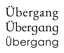
It is common for typefaces intended for use in books for young children to use simplified, single-storey forms of the lowercase letters a and g (sometimes also t, y, l and the digit 4); these may be called infant or schoolbook alternates.
[51][52] Besides alternate characters, in the metal type era The New York Times commissioned custom condensed single sorts for common long names that might often appear in news headings, such as "Eisenhower", "Chamberlain" or "Rockefeller".


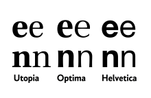
Helvetica has a monoline design and all strokes increase in weight in bold.
Less monoline fonts like Optima and Utopia increase the weight of the thicker strokes more.
In all three designs, the curve on 'n' thins as it joins the left-hand vertical.