Vox-ATypI classification
[1] The classicals can be broken down into 'Venetian', 'Garalde', and 'Transitional' categories, and are characterized by triangular serifs, oblique axis, and low stroke contrast.
The history of Aldine typefaces begins with an Italian punchcutter named Francesco Griffo who worked for the printer Aldus Manutius.
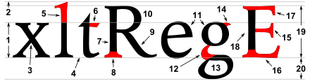
In general, the Aldine typefaces had finer proportions than the Venetians, straight lowercase e bar, no slab serifs and a stronger contrast between downstroke and upstroke.
[3][4] The transitional, realist, or réales are the typical typefaces of the traditional period, particularly embodying the rational spirit of the Enlightenment.
The term realist is unrelated to the artistic movement realism, and derives from the Spanish for 'royal', because of a typeface cast by Christophe Plantin for King Philip II of Spain.
[5] Examples of transitional typefaces include Baskerville, Century Schoolbook, Times New Roman, and other contemporary redesigns of traditional faces.
[3] Lineals, or linéales, combine all typefaces without serifs (called 'sans-serif', 'gothic', or grotesque), all of which correspond to the Antiques of the Thibaudeau classification.
The British Standard 1967 extended the category by breaking the group into 4 subcategories: Grotesque, Neo-Grotesque, Geometric, and Humanist.
[7] According to Monotype, the term "grotesque" originates from Italian: grottesco, meaning "belonging to the cave" due to their simple geometric appearance.
[8] The term arose because of adverse comparisons that were drawn with the more ornate Modern Serif and Roman typefaces that were the norm at the time.
[10] Neo-grotesque typefaces are derived from the earlier grotesque faces, but generally have less stroke contrast and a more regular design.
Humanist typefaces, instead of deriving from the 19th century grotesque faces, relate to the earlier, classical handwritten monumental Roman capitals and a lowercase similar in form to the Carolingian script.
[3] The graphic, manual, or manuaires, are based on hand-drawn originals which are slowly written with either a brush, pen, pencil, or other writing instrument.
The blackletters or German: fraktur [fractured, broken], which Vox included in the graphics, are characterized by pointed and angular forms, and are modeled on late medieval hands written with a broad-nibbed pen.
[15] This heterogeneous family, not included in the original nine Vox groups, gathers (without distinction of style) all writing systems not based on the Latin alphabet: Greek, Cyrillic, Hebrew, Arabic, Chinese, Korean etc.
Dixon challenges the prevalent focus on roman types as being dated, saying "distinctions between text and display are now increasingly irrelevant, with the greater subtlety that has been introduced into sans serifs and slab serif designs, leading to a wider application of such types for text purposes."
[6] Miguel Catopodis, in the ATypI forum, proposed that the full 1962 Vox-AtypI classification needed to be uploaded and made more widely available, because the schema is still an easy resource for many students to understand how typefaces could be classified.