Cosegregation
Interaction probability is determined using specified parts of a target gene (loci) and a group of nuclear profiles (NPs).
Cosegregation used within other mathematical models (SLICE[3] and normalized linkage disequilibrium) assist in rendering 3-D visualizations as a smaller process of genome architecture mapping (GAM).
In a study from 2017, cosegregation was used to understand gene-expression-specific contacts in organizing the genome in mammalian nuclei in the larger process of GAM.
[3] The results of the study produced complex 3D structures that displayed interactions under certain regions of chromatin contacts and proved that GAM is a useful tool in the genome biologist's skill set that expands the ability to finely dissect 3D chromatin structures, cell types and valuable human samples.
"[6] Both of these studies used mice as models due to their anatomical, physiological, and genetic similarity to humans.
Around this time, scientists were conducting experiments on vegetative organisms to see the if there are unique sequences of chloroplast DNA.
This study was done at the Duke University in the Zoology Department[8] where Karen P. VanWinkle-Swift utilized Pedigree Diagrams to show how the traits and sequences were passed down from parent to child.
Variables "A" and "B" are the total number of nuclear profiles (NP) present in a given a detected genomic region slice, "N" is the total number of NPs and FAB is the frequency of A and B This formula can be easily programmed into code as seen in the pseudo-code in the figure to the right.
Given a large dataset of nuclear profiles, cosegregation is easily scalable given its simplistic mathematical formulas.
Fortunately, not only is it able to scale dataset sizes well, it is able to take as many loci of focus that are required to determine the interaction probability.
Provided that adding each loci adds a single computation to the equation, a linear time complexity is the result.
Finally, the numerical value that results can assist in drawing multiple conclusions including radial position, compaction, and the most influential contacts.
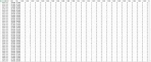
This chart shows a hypothetical data set of 10 people and their cancer status as well as if they possess the four genes of interest.
In that example, cosegregation is being used to describe the linkage of data to each other in terms of the distance between specific windows in a genome.
A heat map is a visual representation of a matrix of m × n that can show different phenomenons on a two-dimensional scale.
Many people understand heat maps intuitively, without even needing to be told that those warmer colors indicate a denser focus of interactions.
"[9] In the limitation section, there are two heat maps (also put below for easy viewing) shown depicting the difference between normalized and un-normalized data.
Cosegregation results as seen above can have different forms and visualizing them in heat maps can aid researchers in understanding which genomes are connected similar to matrices.
One limitation to heat maps are that some software does not allow the use of locating specific points on the graph, especially if there are many variables.
There are coding libraries such as plotly.express that can create interactive heat maps where the programmer can hover over specified points on a graph and read the exact dependent variable's value.
Since heat maps work by aggregating data over time, it does not show recent changes in behavior compared to the more dominant patterns already present.