Fraktur
[a] Fraktur is often characterized as "the German typeface", as it remained popular in Germany and much of Eastern Europe far longer than elsewhere.
Beginning in the 19th century, the use of Fraktur versus Antiqua (seen as modern) was the subject of controversy in Germany.
After Nazi Germany fell in 1945, Fraktur was unbanned, but it failed to regain widespread popularity.
Besides the 26 letters of the ISO basic Latin alphabet,[b] Fraktur usually includes the Eszett ⟨ß⟩ in the ⟨ſʒ⟩ form, vowels with umlauts, and the long s ⟨ſ⟩.
Most older Fraktur typefaces make no distinction between the majuscules ⟨I⟩ and ⟨J⟩ (where the common shape is more suggestive of a ⟨J⟩), even though the minuscules ⟨i⟩ and ⟨j⟩ are differentiated.
In Danish texts composed in Fraktur, the letter ⟨ø⟩ was already preferred to the German and Swedish ⟨ö⟩ in the 16th century.
Fraktur types for printing were established by the Augsburg publisher Johann Schönsperger [de] at the issuance of a series of Maximilian's works such as his Prayer Book (Gebetbuch, 1513) or the illustrated Theuerdank poem (1517).
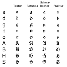
[3] Fraktur quickly overtook the earlier Schwabacher and Textualis typefaces in popularity, and a wide variety of Fraktur fonts were carved and became common in the German-speaking world and areas under German influence (Scandinavia, Estonia, Latvia, Central Europe).
While over the succeeding centuries, most Central Europeans switched to Antiqua, German speakers remained a notable holdout.
Some books at that time used related blackletter fonts such as Schwabacher; however, the predominant typeface was the Normalfraktur, which came in slight variations.
The shift affected mostly scientific writing in Germany, whereas most belletristic literature and newspapers continued to be printed in Fraktur.
[7] However, more modernized fonts of the Gebrochene Grotesk [de] type such as Tannenberg were in fact the most popular typefaces in Nazi Germany, especially for running text as opposed to decorative uses such as in titles.
[8][9] On 3 January 1941, the Nazi Party ended this controversy by switching to international scripts such as Antiqua.
Martin Bormann issued a circular (the "normal type decree") to all public offices which declared Fraktur (and its corollary, the Sütterlin-based handwriting) to be Judenlettern (Jewish letters) and prohibited their further use.
[10] German historian Albert Kapr has speculated that the regime viewed Fraktur as inhibiting communication in the occupied territories during World War II.
[citation needed] More often, some ligatures (such as ch and ck) from Fraktur were used in Antiqua-typed editions up to the offset type period.
[citation needed] Fraktur is today used mostly for decorative typesetting: for example, a number of traditional German newspapers such as the Frankfurter Allgemeine, as well as the Norwegian Aftenposten, still print their name in Fraktur on the masthead (as indeed do some newspapers in other European countries and the U.S.) and it is also popular for pub signs and the like.
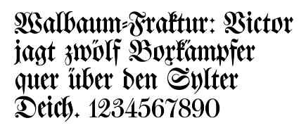
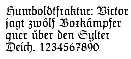
2 reads, Victor jagt zwölf Boxkämpfer quer über den Sylter Deich.
It means "Victor chases twelve boxers across the Sylt dike" and contains all 26 letters of the alphabet plus the umlauted glyphs used in German, making it an example of a pangram.
The long s, ß, and the umlauted vowels are not encoded, as the characters are meant to be used in mathematics and phonetics, so they are not suitable for typesetting German-language texts.
[15] Modern LaTeX implementations (XeTeX, LuaTeX) can utilize a Fraktur font the usual way using the fontspec package.
For traditional implementations (pdfTeX and older), the \mathfrak{◌} command defined in the amssymb, amsfonts or eufrak package is available.