Information design
The term has come to be used for a specific area of graphic design related to displaying information effectively, rather than just attractively or for artistic expression.
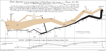
Early instances of modern information design include these effective examples: The Minard diagram shows the losses suffered by Napoleon's army in the 1812–1813 period.
Six variables are plotted: the size of the army, its location on a two-dimensional surface (x and y), time, direction of movement, and temperature.
This multivariate display on a two-dimensional surface tells a story that can be grasped immediately while identifying the source data to build credibility.
[11] The resulting work often seeks to improve a user's trust of a product (such as medicine packaging inserts, operational instructions for industrial machinery and information for emergencies).
Examples of this are the Truth in Lending Act in the USA, which introduced the Schumer box (a concise summary of charges for people applying for a credit card), and the Guideline on the Readability of the Labelling and Package Leaflet of Medicinal Products for Human Use (European Commission, Revision 1, 12 January 2009).
Professor Edward Tufte explained that users of information displays are executing particular analytical tasks such as making comparisons or determining causality.