It follows principles similar to page layout in graphic design, such as balance, gestalt, and visual hierarchy.
Another impact of this relationship is that the cartography profession has largely adopted these principles, with relatively less unique research on the topic by academic cartographers than other aspects.
[2] In practice, it is common in publishing teams for the layout portion to be executed by professional graphic designers, not cartographers.
[10] In addition, a legend may also serve other purposes, including: organizing the symbols into a structure of layers and importance; educating about the subject matter; or describing how the map symbology was created.
Using principles of gestalt, various sets of rules have been created for legend spacing, alignment, and grouping.
[14] The preferred type of scale indicator depends on the purpose and audience of the map: a representative fraction is precise, but most of the public does not know what it means; a very precisely marked scale bar is most useful when distance measurements need to be made, but can be overkill when they do not; many general-audience maps, such as web street maps or atlases, use very simple single-division scale bars to simply give a sense of size.
It may be as simple as a citation of the data sources, but could also include information such as the choice of Map projection, authorship credit, copyrights, date of production and/or source data, and construction methods used, chosen based on the purpose and audience.
Images can also be used to show examples of data points or illustrate the methods used to create the map.
[16] Charts and graphs can provide a non-spatial view of data to support the purpose map.
This allows for data to be visualized in ways that may be more appropriate than a map, such as change over time.A chart can be linked to a table or query and customized by setting various properties.
This map of the
Falkland Islands
incorporates several elements of map layout: a title, a scale bar, a legend, and an inset map. This is a compromise between the
fluid
and
compartmentalized
approaches to layout order, with the non-map elements sitting "on top" of the main map. Here, the top-heavy main map is balanced by the non-map elements below. Note the use of a
locator inset map
and limited additional text about the projection (
metadata
) and sovereignty dispute (
explanatory
), all appropriate for a general audience. The detailed scale bar in two measurement systems facilitates precise distance measurements by an international audience, which may or may not be the intent.
Geologic map
of
Australia
, showing a layout with a strict compartmentalized order that clearly directs attention flow. The four
thematic inset maps
provide visual balance with the main map, which is enlarged to maximize scale and visual hierarchy. Note also the order created by arranging the title and legend consistently in all five maps (thanks to Australia's "serendipitous geography" providing spaces for non-map elements), which eases use but can look a little dull. The detailed legends and extensive
metadata text block
are designed for highly specialized use by a scientific audience.
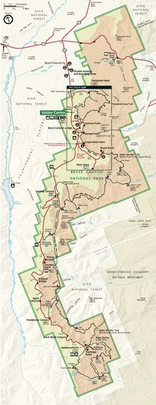
In this map of
Bryce Canyon National Park
,
Utah
, the main map has been rotated to fit the page better; a north arrow (upper left) is necessary to avoid confusion. Note the very simple scale bar, which is effective at giving a general sense of size on a map in which users are not expected to make precise measurements. The light but non-white background color enables the use of white as a map symbol (the county boundary across the center). Also note the central box showing the location of a separate
detail inset map
.
Legend that features point, line, and area symbols and follows rules for grouping
This seismic hazards map uses extension inset maps to display Alaska and Hawaii.
Map of part of the
South Shetland Islands
in
Antarctica
, using several photographs to illustrate the mapped landscape, as well as text blocks for explanatory and metadata purposes. This is a relatively effective use of a
high contrast background
(highlighting the ice cover), although it does present some challenges, such as the green areas that appear as much like ocean as land.