History of BBC television idents
As new technology has become available, these devices have evolved from simple still black and white images to the sophisticated full colour short films seen today.
With the arrival of digital services in the United Kingdom, and with them many more new channels, branding is perceived by broadcasters to be much more important, meaning that idents need to stand out from the competition.
The original BBC Television Service was launched on 2 November 1936 and was taken off the air at the outbreak of war in September 1939, returning in June 1945.
Originally, the mirror globe had a blue logo and landmasses to enhance the clarity of the image on black and white screens.
[2] It was created by the BBC graphics and computer departments with work starting on it in 1983, following the success of the electronic BBC2 ident and the clocks.
The ident consisted of a figure "1" inside a rotating transparent globe surrounded by a swirling smoky atmosphere above the BBC's corporate logo – the bold italic letters B B C within three rhomboids, above three flashes.
A change in controller at BBC One saw the balloon globe icon become the shortest-lived ident package of the colour television era.
The new controller, Lorraine Heggessey, made no secret of her hate for the Balloon idents, as she believed them to be “slow and distant.” Because of this opinion, she ordered a review of the current branding.
This was also the first new presentation package not to include a clock though one had been designed — it had become difficult to transmit the time accurately, given the delay introduced by satellites and digital transmission.
The relaunch brought about a new channel logo once more with the box replaced in favour of a lowercase name, effectively appearing as "BBC one".
Commissioned by the BBC's in-house creative agency, it shows groups of people coming together through their activities in everyday life.
[7][8] A set of "lockdown"-themed Oneness idents were introduced in 2020 due to the COVID-19 pandemic, consisting of themed collages of activities taking place in multiple locations across the United Kingdom.
However, the opening extravaganza was forced to reschedule from 20 April 1964 to the following evening, as the result of a massive power failure in west London.
[nb 4] A facelift occurred on 28 December 1974, with the "2" being formed of blue and white lines, the different colours leaving and entering from opposite sides of the screen.
On 18 February 2007, the channel's presentation package was relaunched with the introduction of idents designed by advertising agency Abbott Mead Vickers BBDO and produced by Red Bee Media, costing £700,000 in total.
The identity was developed by BBC Creative and branding agency Superunion, and consists of various animations based around a curve motif resembling a '2' in the centre.
As a result of this, Lambie-Nairn – the branding agency who designed all the BBC Choice looks – used three different objects which all shared a common theme or word.
At first, the familiar orange boxes could be seen being demolished by a wrecking ball in the final months, and come November 2002, the whole identity was changed to a building site, complete with two builders.
The official launch night revealed the towering three-dimensional figure "THREE" populated by small computer generated "blobs", given voices from the BBC Sound Archive.
In 2008, BBC Three controller Danny Cohen unveiled a new brand for the channel, created by Red Bee Media, and designed to emphasise its new focus on cross-platform programming.
[nb 8] These pipes, or pools of liquid are present in most of the idents, as are large objects that appeal to the young adult audience, or features technology such as television screens.
The initial identity consisted of cartoon characters, illustrated by Michael Sheehy, against an orange background and climbing 'ladders of learning'.
Individual idents for standard section were used for a time which featured an object, a fact about it and ends with a letter encircled at the centre of the screen.
As a result, no idents were ever the same, however variations were produced featuring different visualisations, such as semicircles, vibrating lines or shafts extending from the bottom surface.
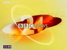
In 2003 the channel was again relaunched with a new common BBC News style featuring a deep red and black globe and background with bright white lettering.
The first look featured a '24' numeral made out of lines bending in on screen, and was more of a cream colour than the white used by other bulletins: this was rectified in 2004.
The channel's first on-screen branding featured the single line BBC Parliament logo over a background similar in style to water and accompanied by an orchestral musical score.
As part of the sequence, occasional pulsating rings are emitted and the soundtrack is in a similar style to the David Lowe BBC News theme.
Following the major BBC News relaunch in 1999 across all output, the channel received an individual style based upon the theme introduced with music composed by David Lowe.
CBeebies was launched on the same day as the CBBC Channel: 11 February 2002, with an original age range of pre-school children only.