Line chart
It is similar to a scatter plot except that the measurement points are ordered (typically by their x-axis value) and joined with straight line segments.
Some of the earliest known line charts are generally credited to Francis Hauksbee, Nicolaus Samuel Cruquius, Johann Heinrich Lambert and the Scottish engineer William Playfair.
He supplemented the chart with a detailed description, telling his readers how to interpret the change over time because they were unfamiliar with this form of abstract visualization.
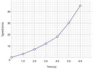
Understanding the process described by the data in the table is aided by producing a graph or line chart of speed versus time.
Charts often include an overlaid mathematical function depicting the best-fit trend of the scattered data.
Further, measurements such as the gradient or the area under the curve can be made visually, leading to more conclusions or results from the data table.
A true best-fit layer should depict a continuous mathematical function whose parameters are determined by using a suitable error-minimization scheme, which appropriately weights the error in the data values.